Knowledge Base / Deep Dives
Principal Component Analysis: A Map of Variation, Not a Verdict
Principal component analysis turns many measurements into a simpler map. This guide explains how rows, scaling, metadata, and evaluation choices shape what that map can mean.
On this page 60 sections
Imagine that you measure the area, perimeter, length, width, compactness, asymmetry, and groove length of every wheat kernel in a collection. You now have seven measurements for each kernel. Looking at one column at a time is manageable. Understanding how all seven columns change together is harder.
Principal component analysis (PCA) is a way to make a simpler map of a spreadsheet with many measurement columns. Each kernel becomes one point on the map. Kernels that differ along the high-variance directions retained in the map tend to land apart. Differences that lie mainly in omitted components can disappear, so a two-dimensional PCA map does not preserve every pairwise distance or neighborhood.
Choose a reading route.
- Learning PCA: continue with the vocabulary and pictures, then follow the wheat-kernel example. The mathematical appendix is optional.
- Working with your own data: start with the data-preparation choices, follow the Python walkthrough, and use the interpretation checklist.
- Inspecting the result: jump to the observed patterns, read the limits, and open the reproduction instructions or mathematical definition as needed.
Before PCA: a tiny vocabulary kit
Observation and row. An observation is one thing being described. In the real dataset used here, it is one measured wheat kernel. It occupies one spreadsheet row and later becomes one point on the PCA map. A feature is one measurement column, such as kernel length or compactness.
The same biological unit can generate several rows, such as repeated images, technical repeats, or measurements at several time points. A row in a prepared table is therefore not automatically an independent biological observation.
Variation. If every plant had exactly the same root length, root length would not vary. If some roots are short and others are long, that feature has variation. Variation is the everyday idea of spread or difference.
Variance. Variance is one numerical way to measure that spread. It asks how far values sit from their average, squares those distances so negative and positive differences do not cancel, and averages the squared distances. Larger variance means the values are more spread out. You do not need to calculate it by hand to follow the pictures.
Variance depends on the numerical scale set by a feature’s units, so raw variances from unlike measurement columns may not be directly comparable.
Covariance. Covariance describes whether paired feature values tend to deviate from their respective averages in the same direction. It is positive when the two features tend to be above or below their averages together, negative when one tends to be above as the other is below, and near zero when those paired linear deviations mostly cancel. Its magnitude depends on the features’ units and scales.
Correlation. Correlation standardizes that covariance by the two features' standard deviations, producing a unit-free value from -1 to +1. If plants with longer primary roots also tend to have more lateral roots, those features have a positive correlation. “Tend to” matters: the relationship does not have to be perfect, and correlation alone does not show that one feature causes the other.
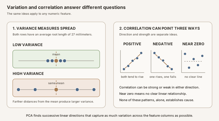
Scroll horizontally to inspect the diagram. The caption below provides a full text explanation.
Axis. An axis is a numbered direction used to locate a point, like the horizontal and vertical directions on graph paper. The original spreadsheet has one axis for every feature. With seven features, an observation has seven coordinates even though we cannot draw all seven directions on a page in a single graph.
Principal component. A principal component is a new axis made by combining the original features. PCA chooses the first new axis to follow the direction with the most variance. It chooses the next perpendicular axis to capture as much of the remaining variance as possible.
The most variable direction is not necessarily the one most relevant to the biological question. It can reflect organism size, developmental stage, which organism supplied a sample, a batch, measurement conditions, or a mixture of sources.
With those terms in place, the compact definition is easier to read: PCA replaces several correlated feature columns with a smaller set of new axes that preserve as much of the spreadsheet’s variation as possible, one axis after another. A PCA plot is a map of observations in that new coordinate system.
Five more terms, translated before we use them.
- Preprocessing means the choices made before PCA, such as combining repeat images, filling missing cells, and putting measurements on comparable scales.
- A batch effect is a pattern caused by how data were collected, such as a microscope, plate, date, or operator, rather than the biology of interest.
- A classifier is a model that tries to assign a category, such as a wheat variety, to a new observation. PCA does not do this by itself.
- Causality is the claim that changing one thing produces a change in another. A PCA pattern alone cannot establish that claim.
- Held-out data are observations deliberately kept out of model fitting so they can provide a fair later test.
PCA is not automatically a classifier, a causal test, or proof that apparent clusters reflect real biological differences. The calculation can be correct while the scientific interpretation is wrong because the analyst misunderstood what a row represents, allowed one measurement scale to dominate, overlooked a batch effect, or let held-out data influence preprocessing.
By the end of this guide, you should be able to answer five practical questions about any biological PCA notebook:
- What biological question is the analysis trying to answer?
- What does one row represent, and should any rows be combined?
- When would a median be justified for repeated or missing measurements?
- What patterns are actually visible in the PCA map?
- You scaled (put features on a comparable numerical scale) and imputed (filled in missing values) the entire dataset before saving it. How could that cause data leakage (test-set information accidentally influencing training) when building a model, and how would you prevent it?
No programming experience is assumed. Read the page in order the first time. Each picture introduces one decision, and each equation appears only after the corresponding idea has been explained visually.
The short version
- Define the point. Decide what one point represents: one image, one organism, one kernel, or a summary of repeated measurements.
- Use measurements only. In this example, PCA receives seven kernel measurements. It does not receive kernel identifiers or wheat-variety labels.
- Check missing cells. Find out why values are missing before replacing them.
- Make columns comparable. If measurements use very different units or numerical ranges, scale them so one column does not dominate just because its numbers are larger.
- Treat the plot as a description. A visible cluster is a pattern to investigate, not proof that a biological group is truly different.
- Ask what shaped each axis. Use the principal-axis coefficients, often called loadings, which show how strongly each original measurement contributes to an axis.
- Split before building a model. If you later test a prediction model, divide the data first. Calculate replacement values, scales, and PCA axes from the training portion only.
The whole trip in one picture
Principal component analysis is one step in a scientific workflow, not the whole workflow. The biological question determines what a row should mean. The row definition determines which measurements may be combined. Cleaning and scaling determine the matrix PCA sees. Only then does PCA learn axes. Metadata labels are added back afterward to help interpret the map.
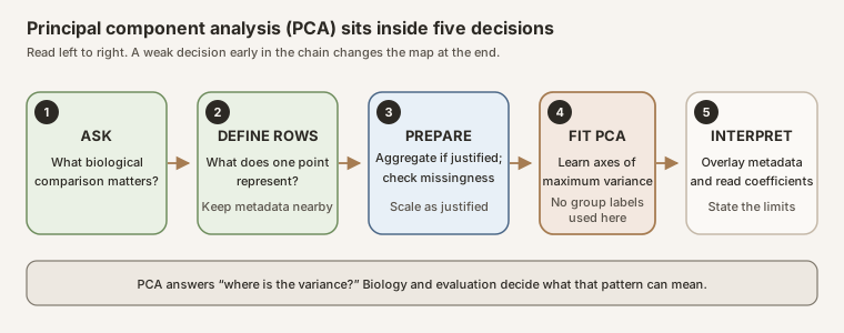
Scroll horizontally to inspect the diagram. The caption below provides a full text explanation.
Keep returning to this picture. Most interpretation mistakes come from skipping one of its boxes.
A real biological example from open data
The worked example asks:
How do seven measured geometric features vary across this collection of wheat kernels, and where do the three recorded wheat varieties land on the resulting PCA map?
The University of California, Irvine (UCI) Seeds dataset contains real measurements of 210 wheat kernels: 70 Kama, 70 Rosa, and 70 Canadian. Researchers used soft X-ray images and the GRAINS image-analysis software to measure area, perimeter, compactness, kernel length, kernel width, asymmetry coefficient, and kernel-groove length. The dataset is licensed under Creative Commons Attribution 4.0 and has no missing values (Charytanowicz and colleagues, 2010).
These seven columns are image-derived summaries of morphology. PCA can summarize how the recorded shapes vary, but it cannot by itself identify the developmental, genetic, or environmental causes of those shapes.
The researchers who introduced the data also used PCA to reduce the seven measurements to two dimensions for visual inspection (Charytanowicz and colleagues, 2010). We calculate our own PCA directly from the open numerical table. Every empirical Portable Network Graphics (PNG) image below is produced by the included Python code from that exact file. None is traced, redrawn, or copied from the paper.
This example starts with pre-cleaned data
The public Seeds file is unusually tidy compared with many laboratory exports. Every measurement column can be read as a number, every row has all seven measurements, the variety codes are consistent, and the table is already arranged with one kernel per row.
Here, pre-cleaned means that the file is already in a usable rectangular format. It does not mean that every measurement is guaranteed to be biologically correct, that outliers are mistakes, or that the missing experimental metadata have somehow been recovered. We still inspect the values before PCA.
Typical preparation required for less-clean data
NaN means “not a number.” pandas commonly uses it to represent a missing numerical value after loading a file. A blank cell, NA, N/A, or another missing-value marker may all become NaN. Never assume that a missing measurement is zero.
| Raw-data problem | What it might look like | Why it matters for PCA | What to do before PCA |
|---|---|---|---|
| Blank or missing entry | An empty cell, NA, N/A, ., or NaN |
Standard PCA requires a complete numerical matrix. Missingness concentrated in one group can also create bias. | Count missing values by feature and biological group. Investigate why they are missing, then justify imputation or exclusion. Do not automatically replace them with zero. |
| Hidden missing-value code | -999, 9999, or 0 used to mean “not measured” |
PCA treats the code as a real extreme measurement and may rotate an axis toward it. | Read the data dictionary, replace documented sentinel codes with NaN, and record the replacement rule. |
| Typing or parsing error | 3.O7 with the letter O, five, 1,25, or a unit stored inside a numeric column |
The column may become text, or some entries may silently turn into missing values. | Parse explicitly, list values that failed conversion, and check the original record rather than guessing the intended number. |
| Impossible or implausible value | A negative kernel width or a decimal point shifted from 3.2 to 32 |
One bad value can create a high-variance direction and strongly influence the PCA map. | Apply biologically and technically justified range checks. Correct from the source record when possible; otherwise flag, exclude, or retain with an explanation. |
| Mixed units | Some lengths recorded in millimeters and others in centimeters | The same biological quantity appears on incompatible scales. Standardization does not repair an unknown unit mistake. | Convert everything to one documented unit before calculating summaries or scaling. |
| Duplicate or repeated measurement | The same kernel entered twice, or several images taken from one kernel | PCA would treat repeats as separate, equally weighted rows and give that biological unit extra influence. Any later uncertainty analysis or evaluation must also account for dependence among repeats. | Identify the independent observational or experimental unit. Remove accidental duplicates or summarize documented technical repeats using a justified rule. |
| Extreme but plausible observation | A kernel far outside the main cloud but still possible | It may strongly affect means, scaling, correlations, and component directions. It might also be real biology. | Inspect the source image and metadata. Run a sensitivity check with and without it, but do not delete it merely to make the plot look cleaner. |
| Inconsistent metadata label | Kama, kama, KAMA, or the wrong variety code |
PCA axes do not use the label here, but mislabeled points can create a false interpretation afterward. | Standardize known spellings, validate code-to-name mappings, preserve the original value, and investigate conflicts. |
The order matters: define what one row represents, repair or flag data problems, examine missingness and suspicious values, and only then create the numerical feature matrix for scaling and PCA.
One vocabulary distinction matters here. Repeated images of the same kernel are technical repeats. Kernels sampled from independently grown plants or plots may provide biological replication, but only when the study design supports treating those plants or plots as independent experimental units (Blainey and colleagues, 2014).
Follow along in Google Colab
This is also a coding tutorial. The wheat-kernel PCA notebook downloads the UCI data, verifies its checksum, and produces the same counts, variance percentages, PCA map, and loading values shown below.
To run it:
- Right-click Download the Colab notebook and choose Save Link As…. Keep the filename ending in
.ipynbso it downloads as a Jupyter notebook instead of a text file. - Open Google Colab.
- Choose File > Upload notebook, then select the downloaded file.
- Choose Runtime > Run all.
- Read the explanation above each code cell and compare your output with each You should see note.
You do not need to install Python or upload a separate dataset. The notebook downloads the 9.1-kilobyte source file directly from UCI, checks that it matches the file used for this page, and then walks through row meaning, missing-value checks, scaling, PCA, scores, principal-axis coefficients, plots, and leakage-safe modeling.
When it finishes, the main checkpoints should be:
- the table contains 210 kernels, with 70 from each recorded variety;
- the seven measurement columns contain no missing cells, so this analysis performs no imputation;
- the first principal component (PC1) contains 71.9% of scaled-feature variance and the second principal component (PC2) contains 17.1%; and
- PC1 and PC2 together contain 89.0% of the variation in the scaled table.
The notebook is a convenient complete copy, but you do not have to leave this page to learn the code. The walkthrough below starts with an empty Colab session, introduces one small operation at a time, and tells you what to look for after each result.
Work through the original data in Python
Step 1: load the tools
Open a blank Colab notebook and put this in the first code cell:
from io import BytesIO
import hashlib
from urllib.request import urlopen

import matplotlib.pyplot as plt
import numpy as np
import pandas as pd
from sklearn.decomposition import PCA
from sklearn.preprocessing import StandardScaler
The lines beginning with import make existing Python tools available. pandas works with tables, matplotlib draws charts, and scikit-learn supplies StandardScaler and PCA. BytesIO, hashlib, and urlopen let us download the exact source file and check that it has not silently changed.
You should see: no printed output. A cell that finishes without an error has loaded the tools successfully.
Step 2: download and verify the source
Run this in a new cell:
DATA_URL = (
    "https://archive.ics.uci.edu/ml/machine-learning-databases/00236/"
    "seeds_dataset.txt"
)
EXPECTED_SHA256 = (
    "1f3f83c0d8485ae9148061389d19628607e3f5660e3d6f40ec9102fb398bb12f"
)

raw_bytes = urlopen(DATA_URL, timeout=30).read()
observed_sha256 = hashlib.sha256(raw_bytes).hexdigest()
assert observed_sha256 == EXPECTED_SHA256
print("Verified the UCI source file")
DATA_URL is the file’s web address. timeout=30 stops waiting and reports an error if the server does not respond within 30 seconds. raw_bytes holds the downloaded file exactly as the computer received it. The long 256-bit Secure Hash Algorithm (SHA-256) value is a digital fingerprint. assert stops the tutorial if the fingerprint differs from the source used to make this page.
You should see:
Verified the UCI source file. If the cell stops atassert, do not continue with an unverified file.
Step 3: give the columns readable names
The downloaded file has numbers but no header row. We supply names from the dataset documentation, then translate variety codes 1, 2, and 3 into names.
FEATURES = [
    "area",
    "perimeter",
    "compactness",
    "kernel_length",
    "kernel_width",
    "asymmetry_coefficient",
    "kernel_groove_length",
]
VARIETIES = {1: "Kama", 2: "Rosa", 3: "Canadian"}

seeds = pd.read_csv(
    BytesIO(raw_bytes),
    sep=r"\s+",
    header=None,
    names=[*FEATURES, "variety_code"],
)
seeds.insert(0, "kernel_id", [f"kernel_{i:03d}" for i in range(1, len(seeds) + 1)])
seeds["variety"] = seeds["variety_code"].map(VARIETIES)
assert seeds["variety"].notna().all()
seeds.head(3)
pd.read_csv turns the text into a table. sep=r"\s+" says that one or more spaces separate adjacent values. header=None says the source has no header row. names= supplies our names in the correct order. The final line asks Colab to display the first three rows.
What does .map(VARIETIES) do?
Read this assignment from right to left:
seeds["variety"] = seeds["variety_code"].map(VARIETIES)
seeds["variety_code"]selects the existing column containing 1, 2, or 3..map(VARIETIES)looks up every code in theVARIETIESdictionary.seeds["variety"] =stores the returned names in a new column calledvariety.
The lookup happens independently for every row:
Existing variety_code |
Dictionary lookup | New variety value |
|---|---|---|
| 1 | VARIETIES[1] |
Kama |
| 2 | VARIETIES[2] |
Rosa |
| 3 | VARIETIES[3] |
Canadian |
The numerical code column is not overwritten. Keeping both columns makes the source encoding and its readable label easy to audit. If the data contained an unexpected code such as 4, .map would return a missing value for that row. The following assert makes the notebook stop instead of silently continuing with an unmapped variety.
Meet the spreadsheet before the mathematics
The first three rows of the cleaned teaching table look like this:
| kernel ID | area | perimeter | compactness | kernel length | kernel width | asymmetry | groove length | variety |
|---|---|---|---|---|---|---|---|---|
| kernel_001 | 15.26 | 14.84 | 0.8710 | 5.763 | 3.312 | 2.221 | 5.220 | Kama |
| kernel_002 | 14.88 | 14.57 | 0.8811 | 5.554 | 3.333 | 1.018 | 4.956 | Kama |
| kernel_003 | 14.29 | 14.09 | 0.9050 | 5.291 | 3.337 | 2.699 | 4.825 | Kama |
The kernel ID and variety are metadata, meaning columns that describe or label an observation. The seven measurements are features. PCA receives only the seven feature columns. The metadata stay attached to the same rows so we can interpret the points afterward.
Pause and check: if an identifier, variety label, treatment label, file path, or plate identifier appears in the PCA feature matrix, stop. Those columns describe a kernel; they are not geometric measurements.
Step 4: check the table before plotting
Never trust a table only because it loaded without an error. Ask how large it is, how many rows have each label, and whether any measurement cells are empty.
print("Table shape:", seeds.shape)
print(seeds["variety"].value_counts())
print("Missing measurement cells:", seeds[FEATURES].isna().sum().sum())
You should see:
(210, 10), 70 kernels for each variety, and 0 missing measurement cells. The 10 columns are one ID, seven measurements, one variety code, and one variety name. The unlabeled pandas row index at the far left is not a data column.
Step 5: begin with a familiar two-axis chart
Before asking PCA to combine seven measurements, look at two measurements directly. This also confirms that each point will represent one kernel.
COLORS = {"Kama": "#4B6787", "Rosa": "#A67C52", "Canadian": "#6F8D5E"}
MARKERS = {"Kama": "o", "Rosa": "s", "Canadian": "^"}

fig, ax = plt.subplots(figsize=(9, 5))
for variety in VARIETIES.values():
    rows = seeds["variety"] == variety
    ax.scatter(
        seeds.loc[rows, "kernel_length"],
        seeds.loc[rows, "kernel_width"],
        color=COLORS[variety], marker=MARKERS[variety], label=variety, alpha=0.8,
    )
ax.set(xlabel="Kernel length", ylabel="Kernel width",
       title="Two of the seven original measurements")
ax.legend()
ax.grid(alpha=0.25)
plt.show()
Read one line inside the loop in plain language: rows is True wherever the variety name matches the current variety. .loc[rows, "kernel_length"] then selects kernel length only from those matching rows.
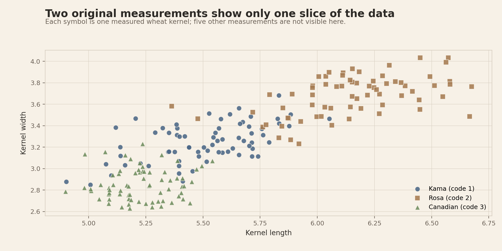
Scroll horizontally to inspect the diagram. The caption below provides a full text explanation.
The partial visual separation does not establish that length and width are the best features for distinguishing varieties. They are simply the two measurements chosen for this preliminary view.
Step 6: look at all seven measurements
The length-versus-width chart hides five columns. Small multiples solve that problem by giving each measurement its own horizontal scale. The dots show all 210 values in every panel. The boxes mark the middle half of each variety’s values, and the line inside each box is the median.
rng = np.random.default_rng(236)  # A random-number generator makes display-only jitter repeatable.
fig, axes = plt.subplots(4, 2, figsize=(12, 12))

for feature, ax in zip(FEATURES, axes.flat):
    groups = [seeds.loc[seeds["variety"] == name, feature] for name in VARIETIES.values()]
    ax.boxplot(groups, positions=[0, 1, 2], vert=False, widths=0.5, showfliers=False)

    for y, variety in enumerate(VARIETIES.values()):
        values = seeds.loc[seeds["variety"] == variety, feature]
        jitter = rng.uniform(-0.16, 0.16, len(values))
        ax.scatter(values, y + jitter, color=COLORS[variety],
                   marker=MARKERS[variety], s=18, alpha=0.65)

    ax.set(yticks=[0, 1, 2], yticklabels=list(VARIETIES.values()),
           xlabel=feature.replace("_", " "), title=feature.replace("_", " ").title())
    ax.invert_yaxis()
    ax.grid(axis="x", alpha=0.25)

axes.flat[-1].remove()  # Seven features leave the eighth panel empty.
plt.tight_layout()
plt.show()
The tiny vertical jitter keeps identical or nearly identical values from covering one another. It does not change any measurement, and it is not used by PCA.
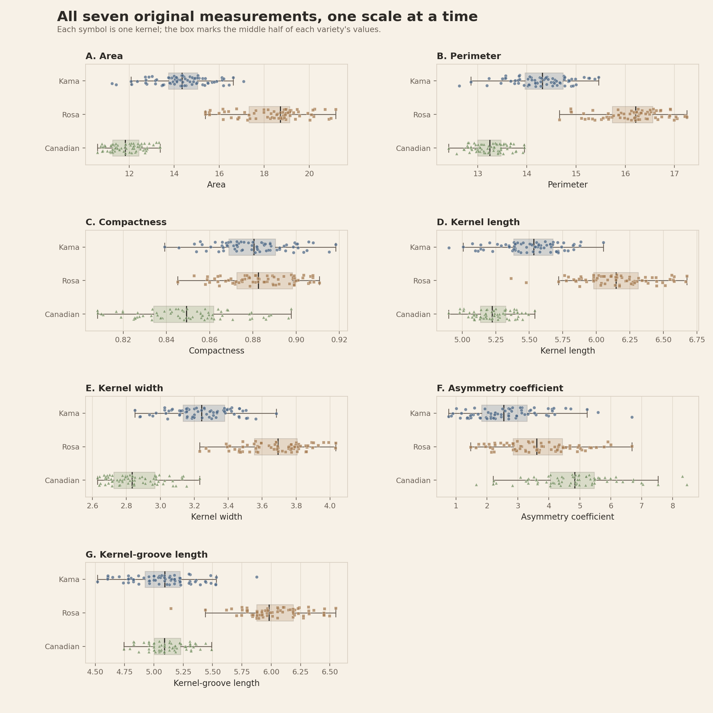
Scroll horizontally to inspect the diagram. The caption below provides a full text explanation.
Step 7: find measurements that move together
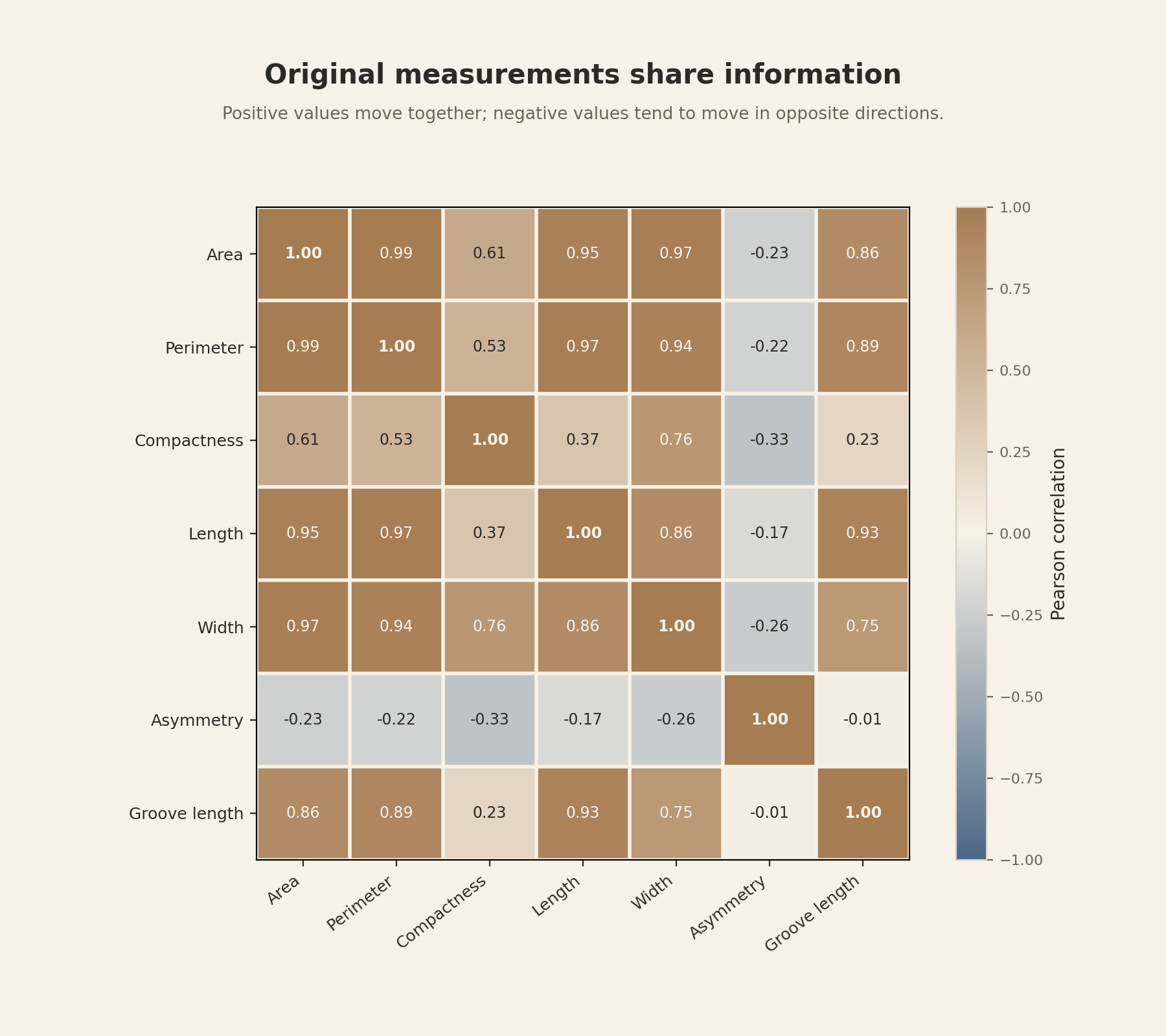
The distribution panels compare one feature at a time. A correlation matrix asks a different question: when one measurement is high, does another measurement also tend to be high or low for the same kernels?
corr = seeds[FEATURES].corr()
fig, ax = plt.subplots(figsize=(9, 8))
image = ax.imshow(corr, vmin=-1, vmax=1, cmap="coolwarm")
short_names = [name.replace("kernel_", "").replace("_coefficient", "").replace("_", " ")
               for name in FEATURES]
ax.set_xticks(range(7), short_names, rotation=40, ha="right")
ax.set_yticks(range(7), short_names)

for row in range(7):
    for column in range(7):
        ax.text(column, row, f"{corr.iloc[row, column]:.2f}",
                ha="center", va="center")

fig.colorbar(image, ax=ax, label="Pearson correlation")
ax.set_title("How the original measurements move together")
plt.tight_layout()
plt.show()
The Pearson correlation is a standardized description of a linear relationship. A value near +1 means two measurements rise together in an almost straight-line pattern. A value near -1 means one tends to fall as the other rises. A value near 0 means there is little straight-line relationship; it does not rule out a curved relationship.
How Pearson correlation is calculated
Choose two features, called \(x\) and \(y\). For this dataset, they might be area and perimeter. Kernel \(i\) has the paired measurements \(x_i\) and \(y_i\). With \(n\) kernels, Pearson correlation is
\[ r_{xy}= \frac{\sum_{i=1}^{n}(x_i-\bar{x})(y_i-\bar{y})} {\sqrt{\sum_{i=1}^{n}(x_i-\bar{x})^2}\sqrt{\sum_{i=1}^{n}(y_i-\bar{y})^2}}. \]Here, \(\bar{x}\) is the average of all the \(x\) values and \(\bar{y}\) is the average of all the \(y\) values. The expression \(x_i-\bar{x}\) asks how far one kernel’s \(x\) measurement lies above or below the \(x\) average. The expression \(y_i-\bar{y}\) does the same for \(y\).
The calculation then follows four ideas:
- Center each feature. Subtract its average from every value.
- Compare paired directions. Multiply the two centered values for each kernel. The product is positive when both measurements are above their averages or both are below. It is negative when they lie on opposite sides.
- Add across kernels. Mostly positive products produce a positive correlation; mostly negative products produce a negative correlation.
- Standardize the result. The two square-root terms in the denominator remove the original units and constrain \(r\) to the range -1 through +1.
If either feature is constant, every value equals its average and one square-root term is zero. Division by zero is undefined, so Pearson correlation is undefined for a constant feature.
For the 210 kernels, area and perimeter usually deviate from their averages in the same direction, giving \(r=0.99\). Asymmetry and groove length have nearly balanced positive and negative products, giving \(r=-0.01\).
Important limit: Pearson correlation measures straight-line association. It does not prove causation, and a value near zero can still hide a curved relationship.
You should see: area and perimeter have a correlation of 0.99, so they carry very similar size information. Asymmetry and groove length have a correlation of -0.01, which is almost no linear relationship in this table. Correlation does not say that one measurement causes the other.
Near-redundancy does not make either area or perimeter biologically meaningless. It means that, within this collection, they encode much of the same between-kernel variation.
Scroll horizontally to inspect the diagram. The caption below provides a full text explanation.
Now we have a concrete reason to try dimensionality reduction: seven columns contain overlapping information, but no single pair of axes shows all of it.
Question 1: What is the biological question?
A useful biological question names the comparison, the measured response, the observational or experimental unit, and the intended scope.
A beginner-friendly sentence template is:
Do these measured features differ between these groups, after considering these other biological or technical sources of variation, in this defined set of samples?
For the wheat-kernel example:
| Part | Explicit choice |
|---|---|
| Comparison | Where the three recorded wheat varieties land on a descriptive map |
| Response | A combined profile of seven kernel-geometry measurements |
| Observational unit | One measured wheat kernel |
| Recorded structure | Seventy kernels in each variety; no batch or repeat identifiers |
| Scope | Description of this public 210-kernel table only |
The public table does not identify the experimental or independent sampling unit. Kernels may share an unrecorded plant, field plot, harvest, or imaging batch, so independence among the 210 rows cannot be verified.
“Run PCA on the features” is a computational task, not a biological question. PCA will find high-variance directions whether or not those directions answer the comparison you care about. In this dataset, overall kernel size may explain more variation than the distinctions among variety labels.
That is not PCA failing. It is answering the question it was designed to answer: which linear directions contain the most variance?
Question 2: What does one row represent?
PCA turns each row into one point. In the UCI table, one row is one measured wheat kernel. The PCA score table preserves that meaning: one row is still the same kernel, now described by component coordinates instead of seven original measurements.
| Table | One row represents | Columns used by PCA |
|---|---|---|
| UCI source table | One measured kernel | Seven geometric measurements |
| Clean teaching table | The same kernel, plus a readable ID and variety name | The same seven measurements |
| PCA score table | The same kernel in the new coordinate system | PC1 through PC7 scores |
We do not aggregate these rows. The source documentation says that 210 kernels were measured, and the public table provides no key showing that several rows belong to one plant, one field plot, or repeated images of one kernel. Combining rows anyway would invent a grouping that is absent from the data.
Notebook checkpoint: this is the complete row check. It confirms 210 kernels and keeps every one as a separate observation.
assert len(seeds) == 210
assert seeds["kernel_id"].is_unique
Aggregation is still an important scientific choice
In another experiment, several rows might be repeated images of the same root or repeated readings from the same organism. Then aggregation might be appropriate. The diagram below preserves the earlier root-profile example because it makes that decision visible. It is a teaching scenario, not a transformation applied to the wheat-kernel data.
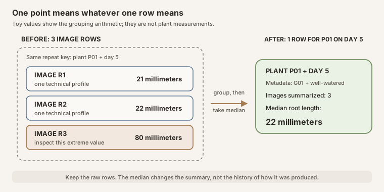
Scroll horizontally to inspect the diagram. The caption below provides a full text explanation.
PCA cannot discover which rows are repeats. The analyst needs a trustworthy identifier for the biological unit. A wrong grouping can combine distinct organisms or leave technical repeats looking like independent samples.
Question 3: When is a median justified?
The honest answer for this dataset is simple: we do not use a median. Each row is a different kernel, so there are no documented repeat rows to combine. All seven measurement columns are complete, so there are no missing values to fill.
missing_by_feature = seeds[FEATURES].isna().sum()
assert missing_by_feature.sum() == 0
That check matters. Adding a median step merely because an earlier notebook used one would alter or complicate a complete dataset without solving a present problem.
Median aggregation in a dataset with real repeats
For three repeated readings \(x_1\), \(x_2\), and \(x_3\) from the same biological unit, a median summary would be
\[ \tilde{x}=\operatorname{median}(x_1,x_2,x_3). \]With the teaching values in the diagram:
\[ \operatorname{median}(21,22,80)=22, \qquad \operatorname{mean}(21,22,80)=41. \]The median is less affected by the extreme value 80. It does not explain why 80 occurred, and it should not replace image-quality checks or technical metadata.
Median imputation in a dataset with missing cells
Imputation means filling a missing cell with a calculated replacement. Median imputation would insert the median of the observed values from that feature. It can produce the complete numerical matrix PCA requires, but it cannot recover the unobserved measurement.
Median imputation is a pragmatic replacement rule, not recovery of the missing measurements. Replacing several cells with one feature median usually reduces that feature’s variance, changes its covariances and correlations with other features, and treats the replacements as if they were known values. Because PCA summarizes this variance-and-covariance structure, compare results under defensible missing-data treatments and report whether the interpretation changes. For inferential work, consider a method that represents missing-data uncertainty when appropriate.
These distortions can be substantial when many values are missing or missingness is concentrated in a biological or technical group.
Before imputing, ask which measurements are missing, why they are missing, whether missingness is concentrated in one biological or technical group, and whether the assumption behind a typical replacement is defensible. For this UCI table, the answer is recorded as “none”: no values are imputed.
Before scaling: what standard deviation means
The mean and standard deviation answer different questions about one feature column:
- The mean tells us where the center is.
- The standard deviation tells us how widely the values spread around that center.
If most values sit close to their mean, the standard deviation is small. If values commonly sit farther from their mean, the standard deviation is larger. It therefore supplies a feature-specific unit for expressing distance from the mean.
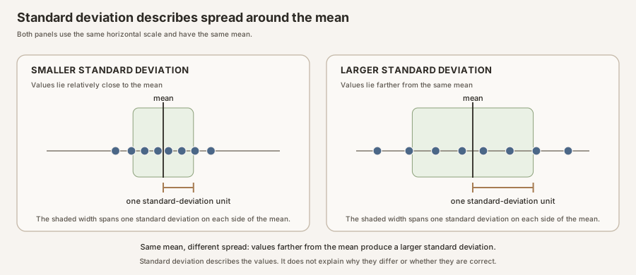
Scroll horizontally to inspect the diagram. The caption below provides a full text explanation.
Build the number one operation at a time
In the formula below, \(j\) identifies the feature column, \(i\) identifies one observation row, and \(n\) is the number of observations in that column.
- Calculate the feature mean, \(\mu_j\).
- Subtract that mean from each observation. The result, \(x_{ij}-\mu_j\), is that observation’s deviation from the mean.
- Square every deviation so values below and above the mean cannot cancel each other.
- Average the squared deviations, then take the square root to return to the feature’s original units.
StandardScaler uses the population-standard-deviation convention shown below
(scikit-learn StandardScaler documentation):
Read the formula from the inside outward. The parentheses measure one observation’s difference from the mean. Squaring makes that difference nonnegative. The sum combines all observations, division by \(n\) forms their average squared deviation, and the square root converts the result back from squared units.
Why do some programs report a slightly different standard deviation?
There are two common conventions. A population standard deviation divides by \(n\). A sample estimate often divides by \(n-1\). StandardScaler uses \(n\), while pandas .std() uses \(n-1\) by default. The underlying idea is the same, but the displayed numbers differ slightly. This convention is why the scaled-column summary later shows about 1.002 instead of exactly 1.000.
Why scaling changes PCA
PCA looks for directions with the most variance. That makes PCA sensitive to how the columns are measured. In this table, area values are commonly above 10, while compactness values are close to 1. A column can therefore have larger numerical variation merely because of its units or scale, not because it is more biologically important.
The idea before the notation
Standard scaling handles one feature column at a time. For each column, it performs the same three operations:
- Calculate that feature’s average across all 210 kernels.
- Calculate that feature’s standard deviation, which describes its typical spread around the average.
- For every kernel, subtract the feature average from its observed value and divide by the feature standard deviation.
In ordinary words:
$$\text{standardized value} = \frac{\text{observed value}-\text{feature average}}{\text{feature standard deviation}}.$$Subtraction answers, “Is this kernel above or below the average for this feature?” Division answers, “How large is that difference compared with the usual spread of this feature?”
Important: area uses the area average and area standard deviation. Kernel width uses the width average and width standard deviation. We do not calculate one grand average across all seven measurement columns.
Now read the compact formula
The mathematical notation says exactly the same thing:
\[ z_{ij}=\frac{x_{ij}-\mu_j}{\sigma_j}. \]The subscripts are spreadsheet addresses:
| Symbol | Spreadsheet meaning | Wheat-kernel example |
|---|---|---|
| \(i\) | The row number, identifying one observation | Kernel 1 |
| \(j\) | The feature column | Kernel length |
| \(x_{ij}\) | The original value in row \(i\), column \(j\) | Kernel 1 has length 5.763 |
| \(\mu_j\) | The mean of every value in feature column \(j\) | Mean kernel length is 5.6285 |
| \(\sigma_j\) | The standard deviation of feature column \(j\) | Kernel-length standard deviation is 0.4420 |
| \(z_{ij}\) | The new standardized value for that same cell | Kernel 1 receives a kernel-length value of about +0.30 |
The Greek letter \(\mu\), pronounced “mu,” is commonly used for a mean. The Greek letter \(\sigma\), pronounced “sigma,” is commonly used for a standard deviation. The small \(j\) attached to each one reminds us that every feature gets its own mean and standard deviation.
Work through one real cell
For kernel 1, the observed kernel length is 5.763. Across all 210 kernels, mean length is 5.6285 and the population standard deviation used by StandardScaler is 0.4420.
First subtract the mean:
\[ 5.763-5.6285=0.1345. \]Kernel 1 is therefore 0.1345 original length units above the mean. Now divide by the usual spread:
\[ z=\frac{0.1345}{0.4420}\approx+0.30. \]The standardized value no longer means “5.763 length units.” It means “about 0.30 standard deviations above the mean kernel length.”
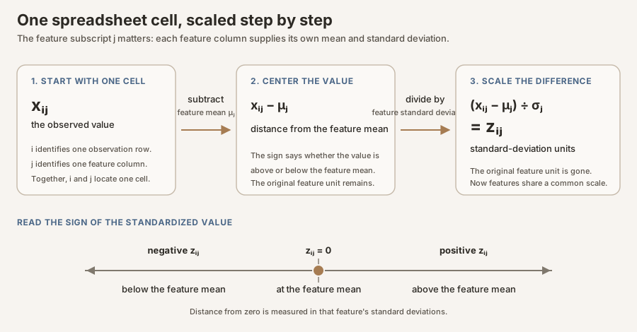
Scroll horizontally to inspect the diagram. The caption below provides a full text explanation.
How to read a standardized value
| Standardized value | Plain-language interpretation |
|---|---|
| \(0\) | Exactly at the feature mean |
| \(+1\) | One standard deviation above the feature mean |
| \(-1\) | One standard deviation below the feature mean |
| \(+2\) | Two standard deviations above the feature mean |
The same interpretation applies to every real measurement in every feature column. After scaling, all seven columns share a common numerical form: the number of feature-specific standard deviations above or below that feature’s mean. PCA can now compare how unusual the measurements are without treating their original numerical units as directly comparable.
What “mean zero and variance one” means
After every value in one feature column is standardized:
- the column mean is 0 because the values are now expressed as deviations around their own mean;
- the population standard deviation is 1 because we divided by the column’s original standard deviation; and
- the population variance is also 1 because variance is the square of standard deviation.
This does not force all values to lie between -1 and +1, make the distribution bell-shaped, remove outliers, or guarantee that the measurements are correct. Scaling changes the coordinate units. It does not clean the biology.
Scaling is a scientific judgment, not a ritual
Scaling encodes the judgment that a one-standard-deviation change should be comparable across features. It puts each feature in feature-specific standard-deviation units; it does not make features equally biologically important or equally reliable, and it does not separate biological variation from measurement noise. Scaling also does not remove redundancy: a large correlated feature family, such as several size measurements, may collectively shape the PCA more than a smaller family. The same dataset can therefore justify different scaling choices for different scientific questions. Scaling may be undesirable when absolute variance is scientifically meaningful, measurement noise differs sharply across features, or the inputs were already normalized in a meaningful way.
The scikit-learn PCA implementation centers but does not scale features automatically. Its documentation therefore treats scaling as a separate preprocessing choice (scikit-learn PCA guide).
Step 8: scale only the seven measurements
seeds[FEATURES] selects the seven columns listed in FEATURES. The ID and variety labels stay out. fit_transform first learns one mean and standard deviation for each selected column, then returns the scaled values.
A constant feature has a standard deviation of zero. It cannot be standardized by dividing by that value, and it contributes no variation for PCA to summarize. Check for constant columns before scaling:
X = seeds[FEATURES]
constant_features = X.columns[X.nunique(dropna=True) < 2].tolist()
assert not constant_features, f"Constant features cannot be standardized: {constant_features}"

scaler = StandardScaler()
X_scaled = scaler.fit_transform(X)

scaled_table = pd.DataFrame(X_scaled, columns=FEATURES)
print(scaled_table.agg(["mean", "std"]).round(3))
You should see: every displayed mean rounds to 0.000. Every displayed standard deviation rounds to about 1.002. The slight difference from exactly 1 comes from pandas and
StandardScalerusing different denominators for this summary; it is expected.
Scroll horizontally to inspect the diagram. The caption below provides a full text explanation.
What PCA computes
First, the picture without symbols
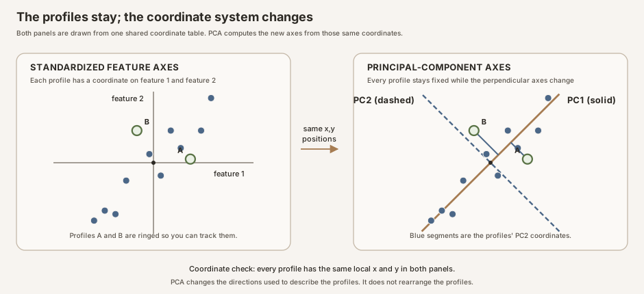
Imagine a narrow cloud of points tilted from lower left to upper right. Ordinary horizontal and vertical axes are valid, but they do not summarize this cloud well because most of its spread lies along the tilt.
PCA draws a new first axis along that longest direction. It draws a second axis perpendicular to the first. Every kernel receives a coordinate on each new axis. Those coordinates are the scores.
The new axes must also be described using the original measurements. Scikit-learn stores the coefficients that define each axis in pca.components_. We call these principal-axis coefficients. Many PCA tutorials also call them loadings.
Why “loadings” can mean two different things
After pca.fit(...) has found the new PCA directions, scikit-learn stores them in pca.components_. Think of components_ as a table:
Part of pca.components_ |
What it means here |
|---|---|
| One row | One principal component. The first row describes PC1, the second describes PC2, and so on. |
| One column | One original wheat-kernel feature, in the same order as FEATURES. |
| One cell | The coefficient for one feature on one principal component. |
This tutorial has seven features and keeps seven components, so pca.components_.shape is (7, 7): seven rows by seven columns. For example, pca.components_[0, 3] is the coefficient for kernel length on PC1. Python starts counting at zero, so 0 selects the first component and 3 selects the fourth feature.
That coefficient is one of the numbers used to calculate a kernel’s PC1 score. Scikit-learn multiplies each standardized measurement by its corresponding PC1 coefficient, then adds the seven results. It repeats the same process with the next row of coefficients to calculate the PC2 score.
Scikit-learn’s formal name for each row is a principal axis in feature space (scikit-learn PCA documentation). A linear-algebra text may describe the same rows as the right singular vectors of the centered input matrix. That advanced phrase describes how the directions are calculated. You do not need it to read or use the coefficient table.
The .T in pca.components_.T means transpose, or turn the table sideways:
| Table | Rows | Columns |
|---|---|---|
pca.components_ |
Principal components | Original features |
pca.components_.T |
Original features | Principal components |
Transposing does not rerun PCA or change any coefficient. It only rearranges the same numbers so that each feature is a row and each component is a column. That orientation is easier to label, read, and plot in this tutorial.
Many tutorials informally call those coefficients “loadings.” Some statistical texts reserve “loadings” for a different quantity, such as the correlation between each original feature and each component. Those correlation loadings are not the values plotted in this guide.
To be precise, the code and plot below use principal-axis coefficient. When this guide uses the shorter word “loading” elsewhere, it refers specifically to these coefficients, not feature-component correlations.
Connect that picture to our wheat table
Immediately before PCA, we have a table with 210 rows and 7 columns:
- Each row is one measured wheat kernel.
- Each column is one standardized measurement, such as area, perimeter, or kernel length.
- The variety code and variety name stay outside this table. They are labels and do not help PCA choose its axes.
PCA keeps all 210 kernels. It does not merge kernels, remove kernels, or predict their varieties. It changes how we describe the position of each kernel.
Before PCA, one kernel needs seven coordinates because it has seven standardized measurements. After PCA, that same kernel can be described by seven new coordinates called PC1 score, PC2 score, and so on through PC7 score. The first few new coordinates are designed to retain as much of the table’s variation as possible.
These axes identify where variation lies, not what produced it. A component can combine biological differences, technical effects, or both. Interpreting its likely source requires returning to the original measurements and relevant metadata such as variety, treatment, batch, date, instrument, or imaging conditions.
Follow one kernel onto PC1
Think of PC1 as a recipe containing seven coefficients, one for each original measurement. PCA finds the recipe that spreads the 210 kernels out as much as possible along one line.
To give one kernel its PC1 score, the software:
- Takes that kernel’s seven standardized measurements.
- Multiplies each measurement by the matching PC1 coefficient.
- Adds the seven results.
The final number is that kernel’s PC1 score, or its position along the PC1 axis. The software repeats this calculation for all 210 kernels, so every kernel receives one PC1 coordinate.
A large positive PC1 score and a large negative PC1 score mean that two kernels lie toward opposite ends of this new axis. Positive does not mean healthy, correct, or biologically better. The two ends could be reversed without changing the PCA.
Then give the same kernel a PC2 coordinate
After finding PC1, PCA looks for another direction that captures as much of the remaining variation as possible. This second direction is PC2.
PC2 must be perpendicular to PC1. In an ordinary two-dimensional graph, perpendicular lines meet at a right angle. The same idea applies in the seven-dimensional coordinate system formed by our seven measurements, even though we cannot draw all seven directions in a single graph. Requiring a right angle prevents PC2 from simply repeating the pattern already summarized by PC1.
PC2 has its own seven-coefficient recipe. Applying that recipe gives each kernel a PC2 score. We can now place a kernel on a flat PCA map using two coordinates:
- its PC1 score determines its left-to-right position;
- its PC2 score determines its bottom-to-top position.
PC2 is not made from a separate subset of measurements. Both PC1 and PC2 can use information from all seven original features, but they combine that information differently.
What the variance percentages mean
An explained-variance ratio reports how much of the standardized table’s total variation lies along one principal component. In this analysis:
| Component | Share of standardized-table variation |
|---|---|
| PC1 | 71.9% |
| PC2 | 17.1% |
| PC1 and PC2 together | 89.0% |
If all variation in the seven standardized measurements is treated as 100%, the two-dimensional PC1-versus-PC2 map retains 89.0% of it. The remaining 11.0% lies along PC3 through PC7 and is not visible in that two-axis map.
That does not mean PCA explains 89.0% of wheat biology. It also does not mean the varieties can be predicted with 89.0% accuracy or that a visible grouping is 89.0% certain. It means only that these two new axes retain 89.0% of the variation in this particular scaled measurement table.
Readers who want the matrix notation, optimization rule, and singular value decomposition can find the full derivation in Appendix B.
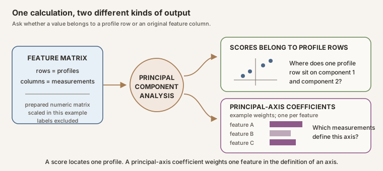
Scores and principal-axis coefficients answer different questions
| Quantity | Indexed by | Practical question |
|---|---|---|
| Score | Observation row and component | Where does this observation fall on the new axis? |
| Principal-axis coefficient, called a loading here | Original feature and component | Which measured features define the new axis, and in which direction? |
| Explained-variance ratio | Component | How much fitted matrix variance lies along this axis? |
Scroll horizontally to inspect the diagram. The caption below provides a full text explanation.
Why your PCA plot might look mirrored
PCA finds an axis, but it does not decide which end must be positive. The same valid PC1 axis can point left or right, just as the same ruler can be turned around.
If software reverses an axis:
- every score on that axis changes from positive to negative, or negative to positive;
- every principal-axis coefficient for that axis changes sign too;
- the spacing between kernels and the percentage of variance stay exactly the same.
Only the direction of the display has changed. The biological interpretation has not.
To keep the tutorial’s figures consistent, our code displays PC1 with a positive area coefficient and PC2 with a positive compactness coefficient. This is a display choice, not a biological result. A mirror image produced by other software can be equally correct.
Step 9: fit PCA and inspect the variance percentages
PCA(svd_solver="full") creates the analysis and fixes the numerical method to full singular value decomposition. fit_transform(X_scaled) learns the axes from the scaled measurements and gives every kernel its new coordinates. The variety column is still not involved.
pca = PCA(svd_solver="full")
scores = pca.fit_transform(X_scaled)

# A component can be mirrored without changing the PCA. Keep this page's orientation.
if pca.components_[0, FEATURES.index("area")] < 0:
    pca.components_[0] *= -1
    scores[:, 0] *= -1
if pca.components_[1, FEATURES.index("compactness")] < 0:
    pca.components_[1] *= -1
    scores[:, 1] *= -1

variance_percent = pca.explained_variance_ratio_ * 100
print("PC1:", round(variance_percent[0], 1), "%")
print("PC2:", round(variance_percent[1], 1), "%")
print("PC1 plus PC2:", round(variance_percent[:2].sum(), 1), "%")
You should see: PC1 is 71.9%, PC2 is 17.1%, and together they are 89.0%. These percentages describe variation in this scaled seven-feature table, not a percentage of biology explained.
The two if blocks only choose which end of each axis receives a positive sign so your plots match this page. They do not change distances, variance percentages, or the biological relationships.
Question 4: What patterns are actually visible?
Read the figure in four passes:
- Axes: read the variance percentages on both axes.
- Points: find the densest regions, gaps, and outliers without using the legend.
- Metadata: use one color or shape overlay at a time.
- Principal-axis coefficients: return from the abstract axes to the original measurements.
Step 10: draw the PCA map
First attach the PC1 and PC2 coordinates to the correct kernel rows. Then draw the score map on the left and the variance percentages on the right.
score_table = seeds[["kernel_id", "variety"]].copy()
score_table["PC1"] = scores[:, 0]
score_table["PC2"] = scores[:, 1]

fig, (ax_scores, ax_variance) = plt.subplots(1, 2, figsize=(13, 5))
for variety in VARIETIES.values():
    rows = score_table["variety"] == variety
    ax_scores.scatter(
        score_table.loc[rows, "PC1"], score_table.loc[rows, "PC2"],
        color=COLORS[variety], marker=MARKERS[variety], label=variety, alpha=0.8,
    )
ax_scores.axhline(0, color="0.6", linewidth=1)
ax_scores.axvline(0, color="0.6", linewidth=1)
ax_scores.set(xlabel=f"PC1 ({variance_percent[0]:.1f}%)",
              ylabel=f"PC2 ({variance_percent[1]:.1f}%)", title="Kernel scores")
ax_scores.legend()

component_numbers = np.arange(1, 8)
ax_variance.bar(component_numbers, variance_percent)
ax_variance.set(xlabel="Principal component", ylabel="Variance represented (%)",
                title="Explained variance", xticks=component_numbers)
plt.tight_layout()
plt.show()
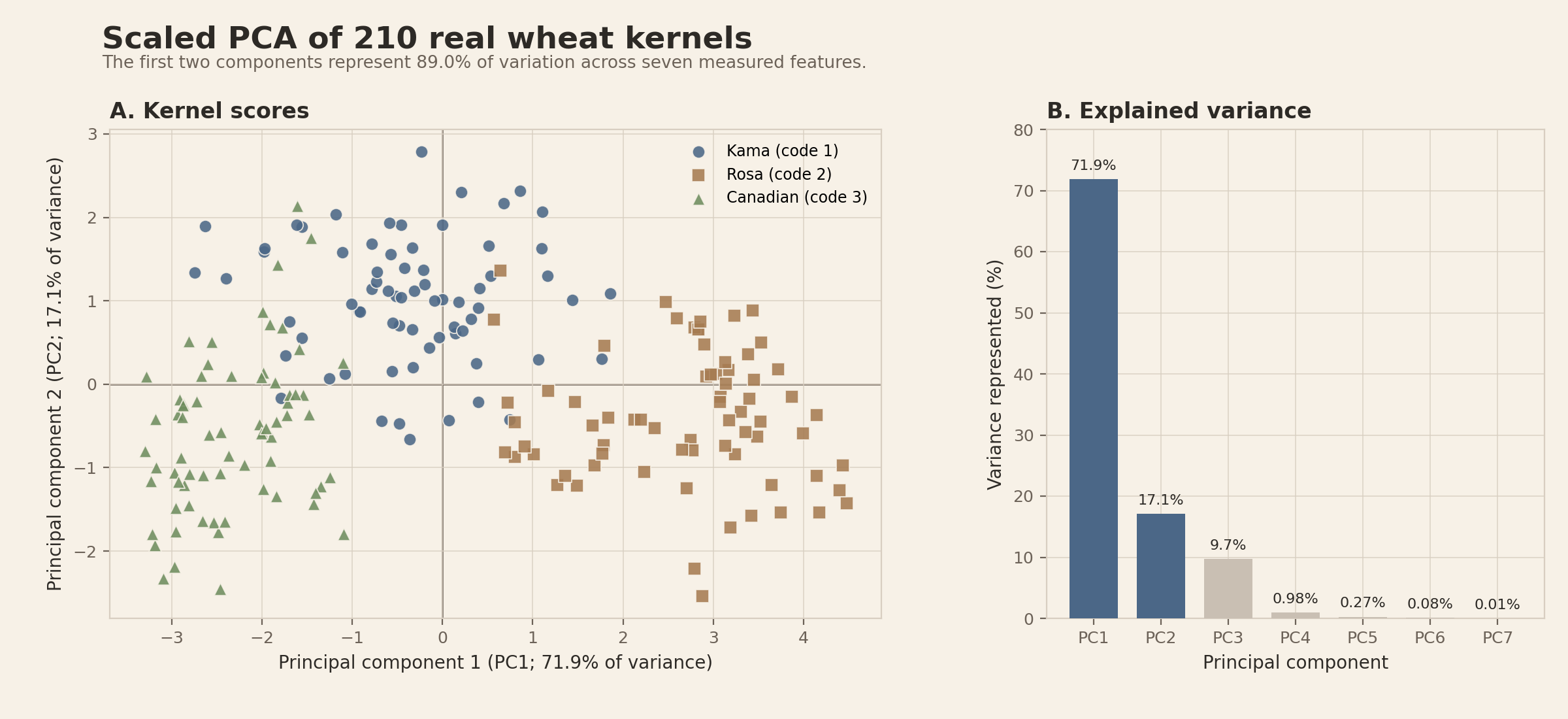
You should see: 210 points on the left. Rosa kernels tend toward one side of PC1, Canadian kernels toward the other, and Kama kernels occupy an intermediate, overlapping region. The bars on the right make clear why PC1 and PC2 are shown first.
Scroll horizontally to inspect the diagram. The caption below provides a full text explanation.
Begin with the score-and-variance figure in two passes.
First, inspect the axes. PC1 contains 71.9% of variance in this fitted matrix, while PC2 contains 17.1%. The first two axes therefore preserve 89.0% of the scaled table’s variation. PC3 contains another 9.7%, so the two-dimensional map still omits real structure.
Second, inspect the points before turning the variety labels into a story. Rosa kernels tend to have positive PC1 scores, Canadian kernels tend to have negative scores, and Kama kernels sit mostly between them. The regions overlap.
PCA received only the seven kernel measurements when it calculated PC1, PC2, and every kernel’s position. It was not given the variety column, so it could not deliberately arrange Kama, Rosa, and Canadian kernels into separate regions. Only after PCA had finished did the plotting code match each point to its variety name and give the three varieties different marker shapes. The shapes help us inspect the finished map, but they had no influence on how PCA constructed the axes.
Step 11: calculate and plot the principal-axis coefficients
pca.components_ stores one principal-axis vector per row. Transposing it with .T turns that into the easier-to-read form used below: one row per original measurement and one column per component.
component_coefficients = pd.DataFrame(
    pca.components_.T,
    index=FEATURES,
    columns=[f"PC{i}" for i in range(1, 8)],
)
print(component_coefficients[["PC1", "PC2"]].round(3))

fig, axes = plt.subplots(1, 2, figsize=(12, 5), sharey=True)
for component, ax in zip(["PC1", "PC2"], axes):
    values = component_coefficients[component]
    ax.barh(component_coefficients.index, values)
    ax.axvline(0, color="0.5", linewidth=1)
    ax.set(xlabel="Principal-axis coefficient", title=component, xlim=(-0.82, 0.82))
axes[0].invert_yaxis()
plt.tight_layout()
plt.show()
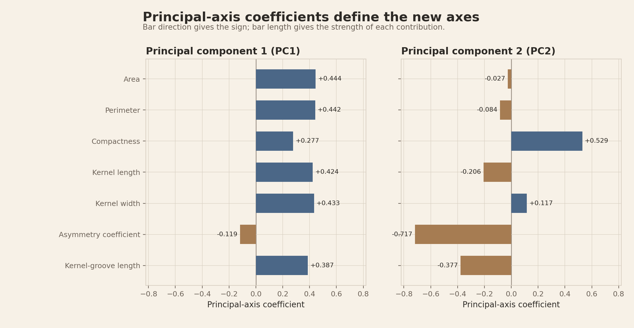
You should see: PC1 has similarly sized positive coefficients for area, perimeter, length, width, and groove length. PC2 is most strongly negative for asymmetry and positive for compactness. Your entire PC1 or PC2 may appear mirrored because a component’s sign is arbitrary; the relationships remain the same.
Scroll horizontally to inspect the diagram. The caption below provides a full text explanation.
components_.T, often informally called loadings. They are not feature-component correlations. Bar position and printed signs carry the meaning without relying on color. Component signs are arbitrary and may be mirrored together with all scores. The complete coefficient table is pca_loadings.csv, plotting code is in reproduce.py, and artifact hashes are in the receipt.Find the strongest coefficients instead of guessing from the bars
Now make the third interpretive pass: inspect the principal-axis coefficients to connect PC1 and PC2 back to the original measurements.
A coefficient can be strongly positive or strongly negative. Both indicate a strong contribution to the axis, so we rank coefficients by their absolute value, meaning their distance from zero without considering the sign. For example, the absolute value of \(-0.717\) is \(0.717\).
The following code finds the three coefficients farthest from zero on each axis, then prints their original signs:
for component in ["PC1", "PC2"]:
    coefficients = component_coefficients[component]

    # Use absolute values only to identify the three strongest coefficients.
    strongest_features = coefficients.abs().nlargest(3).index

    # Look up the original values so the printed positive and negative signs remain.
    strongest_coefficients = coefficients.loc[strongest_features]
    print(f"\n{component}")
    print(strongest_coefficients.round(3))
Read the key operations from left to right:
coefficients.abs()temporarily converts every coefficient to a non-negative magnitude..nlargest(3)selects the three largest magnitudes..indexreturns the names of the corresponding measurements.coefficients.loc[strongest_features]goes back to the original table so the signs are restored.
The code produces the values summarized here:
| Component | Feature | Principal-axis coefficient |
|---|---|---|
| PC1 | Area | +0.444 |
| PC1 | Perimeter | +0.442 |
| PC1 | Kernel width | +0.433 |
| PC2 | Asymmetry coefficient | -0.717 |
| PC2 | Compactness | +0.529 |
| PC2 | Kernel-groove length | -0.377 |
So what did this PCA actually teach us?
The point of this analysis is not merely to turn seven columns into a two-axis plot. PCA revealed which combinations of measurements account for most of the differences among these 210 kernels, and it showed how the recorded varieties relate to those combinations.
1. Most of the measured variation follows one broad size-related pattern.
PC1 alone represents 71.9% of the standardized table’s variation. Area, perimeter, kernel width, kernel length, and kernel-groove length all have similarly sized positive coefficients on the displayed PC1 axis. A kernel with a high PC1 score therefore tends to be larger across several of these measurements at once, rather than differing in only one measurement.
This confirms something suggested by the correlation heat map: several size-related columns contain overlapping information. PCA combines that shared pattern into one coordinate instead of asking us to interpret five strongly related measurements separately.
2. The next important pattern is not simply “more size.”
PC2 represents another 17.1% of variation. Its strongest coefficients are negative for asymmetry, positive for compactness, and negative for kernel-groove length. PC2 therefore describes a shape contrast that is different from the broad size-related pattern on PC1.
This is useful because two kernels with similar PC1 scores can still differ along PC2. The second axis reveals a kind of morphological variation that a simple larger-versus-smaller summary would miss. Calling PC1 “size-related” and PC2 an “asymmetry-versus-compactness contrast” is our interpretation of the coefficient patterns, not a name supplied to PCA.
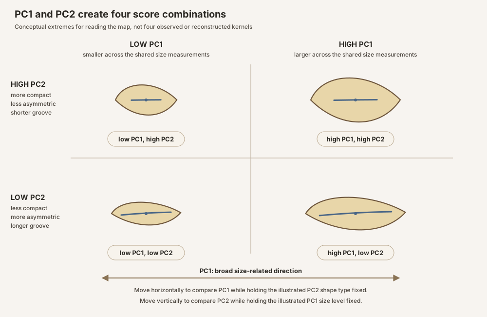
Scroll horizontally to inspect the diagram. The caption below provides a full text explanation.
3. The three recorded varieties occupy different average regions.
We can calculate the average PC1 and PC2 position, called the centroid, for each variety:
variety_centroids = (
    score_table
    .groupby("variety")[["PC1", "PC2"]]
    .mean()
    .round(2)
)
print(variety_centroids)
You should see:
| Variety | Mean PC1 score | Mean PC2 score |
|---|---|---|
| Canadian | -2.32 | -0.61 |
| Kama | -0.36 | +1.02 |
| Rosa | +2.68 | -0.41 |
In the displayed orientation, Rosa has the highest average position on the size-related PC1 axis, Canadian has the lowest, and Kama lies nearer the middle. Kama has the highest average PC2 score, placing its center farther toward the compactness-positive side of the PC2 contrast.
These averages summarize real structure in this collection. They are especially interesting because PCA was not given the variety labels when it constructed the axes. However, a centroid describes the center of a variety, not every kernel in it. The point clouds overlap, so these results do not provide a perfect rule for identifying individual kernels.
Overlap is compatible with genuine group-level differences because individuals vary; complete separation in morphology space is not required.
4. Two dimensions provide a strong overview, but not the whole dataset.
PC1 and PC2 together retain 89.0% of the variation in the standardized measurements. That makes the two-axis map a useful summary of this dataset. The remaining 11.0% is not imaginary or unimportant: PC3 alone contains another 9.7%, and an individual difference may be visible there even when it is hidden in the PC1-versus-PC2 map.
The useful conclusion
Across these 210 kernels, several correlated size measurements collapse into one dominant size-related direction. A second direction captures a different shape contrast involving asymmetry, compactness, and groove length. The recorded varieties differ in their average positions along those directions, while individual kernels still overlap.
That conclusion gives us a clearer description of multivariate kernel morphology and generates questions for further study. It does not yet establish classification accuracy, statistical significance, causality, or generalization to wheat grown in other places or conditions.
What overlap and separation do not prove
Visible separation can arise from the biology of interest, a confounder, a technical batch, preprocessing, unequal group composition, an outlier, or a combination of these. PCA does not know which metadata label matters biologically. The variety labels are added after the axes are fitted.
Visible overlap in PC1 and PC2 does not prove that no group signal exists. A difference may lie in later components, a low-variance feature, a nonlinear relationship, or a paired contrast hidden by between-subject variation. Conversely, a supervised model finding a boundary does not prove that the boundary generalizes or reflects the desired biology.
PCA is primarily descriptive in this role. Statistical uncertainty, generalization, and causality require designs and analyses built for those questions.
How PCA can go wrong even when the code is correct
A population-genetics study by Elhaik demonstrates this problem forcefully. The author repeatedly changed which populations were included, how many individuals represented each population, which genetic markers were used, and which components were displayed. The resulting PCA maps could support conflicting stories about the same populations (Elhaik, 2022).
This principle is not unique to population genetics. Adding specimens, batches, laboratories, treatments, or time points creates a new matrix, so a changed PCA may correctly describe changed sampling rather than a software failure.
The relevant lesson is not that PCA produces random answers. For a fixed numerical matrix, implementation, and solver, PCA returns the same fitted component subspaces up to numerical precision. Individual component signs remain arbitrary. If two components have exactly equal explained variance, any perpendicular rotation within their shared subspace is equally valid. Near-equal values can also make the individual axes numerically unstable even when the combined subspace is stable.
The larger interpretive problem is that each revised set of observations creates a different matrix, so PCA answers a different question. A two-dimensional map can also distort distances that exist across all the original dimensions. Treating the spacing between points or apparent groups as direct evidence of ancestry, migration, gene flow between populations, or biological distance therefore reaches beyond what the plot establishes.
Elhaik argues that a large body of population-genetics research should be reevaluated. That is a broad, domain-specific conclusion from one critical study, not proof that PCA is useless in every biological setting. Other population-genetics researchers describe concrete ways to use PCA more carefully, including checking for unequal population sizes, linkage disequilibrium, outliers, unstable projections, and components driven by a small genomic region (Privé and colleagues, 2020). Linkage disequilibrium means that nearby genetic variants are inherited together more often than would be expected if they were independent.
For an exploratory biological PCA, perform a sensitivity check, meaning that you repeat the analysis after reasonable changes and see whether the interpretation survives:
Sensitivity-check worksheet
- Balance groups: Repeat PCA with balanced group sizes when one group greatly outnumbers the others.
- Remove one group at a time: Ask whether the axes and apparent relationships change.
- Vary defensible analysis choices: Compare feature sets, scaling rules, missing-value decisions, and outlier rules.
- Inspect later components: Look beyond PC1 and PC2, and report how much variance the displayed components omit.
- Identify what drives each axis: Read scores together with principal-axis coefficients. Check whether a batch, one feature, or a small feature family dominates an axis.
- Keep an analysis record: Write down each version you tried. Do not show only the version that supports the preferred story.
If the conclusion changes under a reasonable alternative, the honest result is that the PCA interpretation is sensitive to the analysis choices. The solution is not to select the most attractive plot. It is to report the instability and use an analysis designed for the biological claim.
Question 5: Why can preprocessing the entire dataset cause leakage?
So far, we have used PCA to describe all 210 kernels. Now imagine a different goal: train a model to predict the variety of kernels it has never seen before.
To evaluate that model honestly, we must first set aside some raw observations as a test set:
- The training set is used to learn preprocessing rules, PCA axes, and the prediction model.
- The test set is kept out of that learning process. It is used only at the end to imitate new, unseen data.
The test set can serve as a fair check only if it has not already influenced the training process. The split must therefore happen before any learned or data-adaptive preprocessing. Start with the analysis rows, divide them into training and test sets, and then learn every estimated value, selected feature, or data-dependent rule from the training set alone.
Not every operation performed before a split causes leakage. Fixed parsing, documented unit conversion, and genuinely predeclared validity checks may be applied consistently before splitting because they do not learn from the observed dataset. Imputation values, scaling parameters, PCA axes, feature selection, and rules chosen after inspecting the data must be fitted within the training subset.
What goes wrong if preprocessing happens first?
Suppose you calculate feature medians, means, and standard deviations from all rows, transform the whole table, and only then create the training and test sets. Those preprocessing values have already learned something from the future test rows:
- median imputation learns one median per feature;
- standard scaling learns one mean and standard deviation per feature.
PCA learns component directions from the measurements it receives, and feature selection learns which measurements to keep. They create the same risk when they are fitted before the split.
The model may never see the test-set variety labels, but the test measurements have still helped determine the replacement values, scales, selected features, or PCA axes applied to the training rows. Information from the test set has crossed into the training process.
Data leakage is the name for this accidental flow of test-set information into model training. It can make a model appear to perform better on unseen data than it really does.
This does not make our full-dataset descriptive PCA invalid. Using every row is appropriate when the stated goal is to describe those same 210 kernels and no held-out prediction claim is being made. The leakage problem begins when we claim to evaluate prediction on unseen observations but allow those observations to influence preprocessing or model fitting.
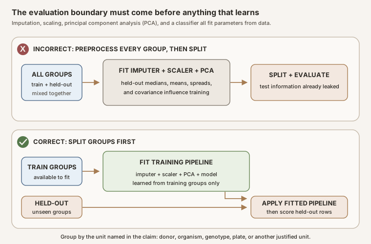
Scroll horizontally to inspect the diagram. The caption below provides a full text explanation.
The test rows still need to be imputed, scaled, and projected before the model can evaluate them. The important rule is that they must use medians, scales, and PCA axes learned from the training rows. They may pass through the fitted transformations, but they may not help fit those transformations.
The safe sequence is:
Leakage-safe modeling sequence
- 1. Define the grouping unit that must remain together.
- 2. Split the analysis rows before learned or data-adaptive preprocessing.
- 3. Fit the imputer on training rows only if missing values require imputation.
- 4. Transform both subsets using replacement values learned from the training rows.
- 5. Fit the scaler on training rows only.
- 6. Transform both subsets using the training means and standard deviations.
- 7. Fit PCA on the scaled training rows only.
- 8. Project the held-out rows onto the components learned from the training rows.
- 9. Fit the classifier on training scores, then evaluate it once on the held-out scores.
The scikit-learn common-pitfalls guide explicitly names StandardScaler, SimpleImputer, and PCA as transformations that can leak held-out information, and recommends pipelines so fitting happens within the correct training subset (scikit-learn common pitfalls).
For a limited exercise that predicts the recorded variety of held-out kernels from this same collection, a pipeline can look like this:
from sklearn.decomposition import PCA
from sklearn.impute import SimpleImputer
from sklearn.linear_model import LogisticRegression
from sklearn.model_selection import StratifiedKFold, cross_val_score
from sklearn.pipeline import make_pipeline
from sklearn.preprocessing import StandardScaler

pipeline = make_pipeline(
    SimpleImputer(strategy="median"),
    StandardScaler(),
    PCA(n_components=4, svd_solver="full"),
    LogisticRegression(max_iter=2_000),
)

folds = StratifiedKFold(n_splits=5, shuffle=True, random_state=7)
scores = cross_val_score(
    pipeline,
    seeds[FEATURES],
    seeds["variety_code"],
    cv=folds,
)
On each cross-validation split, the pipeline fits imputation, scaling, PCA, and the classifier using the training kernels only. The held-out kernels are transformed using medians, scales, and component axes learned from the training kernels. The imputer does not change the current complete table. With missing input, SimpleImputer(strategy="median") replaces each empty cell using that feature’s median learned from the training fold (scikit-learn SimpleImputer documentation).
The grouping rule must match the scientific claim. This file has no field, harvest, plate, plant, or repeat identifiers. Stratified kernel-level folds produce scores for rows withheld from this table, and the pipeline prevents those rows from fitting imputation, scaling, PCA, or the classifier. However, unrecorded relationships or shared batches could cross folds, so the table cannot verify that this split respects independence. These row-level scores do not establish performance for new plants, fields, harvests, plates, or populations. A stronger biological evaluation would require the relevant identifiers and would keep each corresponding group within a single fold.
In other biological systems, related rows may share a donor, tissue, animal, culture, litter, family, or patient. Those relationships are part of the study design, not statistical conveniences, and should determine which rows stay together during splitting.
Exploratory PCA is a different use case
Fitting PCA to the complete dataset is appropriate when the stated goal is simply to describe that dataset. There is no held-out performance claim in a purely exploratory map.
The mistake is to reuse globally imputed, globally scaled, or globally fitted PCA features for supposedly held-out model evaluation. Keep exploratory outputs separate from the modeling pipeline, and name them accordingly.
The five answers in plain language
The five questions now have short answers:
- Biological question: We are asking how seven kernel measurements vary across these 210 kernels and where the three recorded wheat varieties land on the descriptive map.
- Row meaning: One row is one measured kernel before PCA and the same kernel expressed as component scores afterward. We do not aggregate because the public file identifies no repeated rows.
- Median choice: We use no median here. The measurement table has no missing cells and no documented repeats. In another dataset, aggregation and imputation would be separate decisions requiring separate evidence.
- Visible pattern: PC1 represents 71.9% of scaled-feature variation, PC2 represents 17.1%, and the varieties tend to occupy different but overlapping regions. PCA did not use variety labels to learn the axes.
- Leakage: Full-data scaling is acceptable for describing this complete table. If we later claim held-out prediction performance, we must split first and fit imputation, scaling, PCA, and the model inside each training fold.
In biological research, PCA is often the beginning of a conversation rather than the end of an analysis. Components do not arrive with biological meanings; those meanings emerge by combining the mathematical results with experimental knowledge and metadata. The patterns can motivate follow-up experiments, statistical analyses, or properly held-out predictive models. The same principles apply whether rows describe wheat kernels, image-derived morphology, gene-expression profiles, ecological surveys, or other high-dimensional biological tables.
A practical interpretation checklist
Do not try to judge a PCA figure from the point cloud alone. Work through these four passes before accepting the interpretation.
Pass 1: identify the biological design
- Question: Is the biological comparison stated independently of PCA?
- Observation: What physical or biological entity does one point represent?
- Dependence: Which rows share a donor, organism, genotype, well, plate, batch, or time series?
Pass 2: audit the feature table
- Features: Were identifiers, labels, and technical paths excluded from the measurement matrix?
- Missingness: Was the missing-data pattern investigated before values were filled?
- Aggregation: Why is the mean, median, or no aggregation appropriate?
- Scaling: What scientific meaning is assigned to a one-standard-deviation change?
Pass 3: read what the PCA found
- Variance: How much variation is represented by the displayed components, and how much is absent?
- Principal-axis coefficients: Which original measurements define each visible direction?
- Confounding: Could day, batch, plate, subject, or group imbalance explain the pattern?
Pass 4: challenge the claim
- Non-claim: Is it clear that a PCA map alone does not establish classification, significance, causality, or generalization?
- Evaluation boundary: If predictive performance is reported, were imputation, scaling, PCA, and model fitting performed inside each training fold?
Appendix A: reproduce the teaching example
For a guided run, start with the wheat-kernel PCA Colab notebook. It downloads and checksum-verifies the same UCI file, explains each stage, displays an expected result after each important cell, and saves new score and loading tables at the end.
For an exact artifact audit from a local command line, the page bundle includes the reproducible generator, locked dependency graph, unmodified UCI source file, readable measurement table, PCA coordinates, complete principal-axis coefficients, analysis and figure receipt, and provenance manifest. The manifest also binds the downloadable notebook to its committed SHA-256 hash. The coefficient file retains its established pca_loadings.csv name for link compatibility.
Generate every derived table, empirical figure, and featured card with:
uv run --frozen reproduce.py --generate
Within the locked, supported software environment, regenerate every artifact in a temporary directory and require byte-for-byte agreement with the committed bundle using:
uv run --frozen reproduce.py --verify
The generator verifies the original UCI file against its SHA-256 checksum, uses pinned NumPy and Matplotlib versions, declares a sign convention for all seven components, and checks every regenerated artifact byte for byte. The receipt and manifest record the reference Python, operating system, architecture, NumPy, Matplotlib, FreeType, and rendering-backend versions so a mismatch can be diagnosed without recording a hostname, username, or working path. The numerical PCA subspace is reproducible beyond that exact environment, but last-bit floating-point values and rendered PNG bytes can vary with the operating system or numerical libraries. The PNG figures are code outputs from the numerical data. The conceptual SVGs elsewhere on this page teach general relationships and do not contain empirical results.
Appendix B: the mathematical definition of PCA
This appendix expresses the same steps from the main tutorial in compact mathematical notation. You do not need this derivation to run or interpret the Python example.
Write the wheat table as a matrix
We use \(X\) to represent the complete centered or standardized feature table. The notation
\[ X\in\mathbb{R}^{n\times p} \]says that \(X\) is a rectangular table of real numbers with \(n\) rows and \(p\) columns. The symbol \(\mathbb{R}\) means real numbers, including positive values, negative values, and decimals.
For this tutorial:
- \(n=210\) because there are 210 kernel observations;
- \(p=7\) because PCA uses seven measurement features;
- therefore, \(X\in\mathbb{R}^{210\times 7}\).
The variety code and variety name are not part of \(X\). They are labels, not measurements used to calculate the principal components.
Define the first principal component
A possible direction through the seven-feature space is represented by \(v\). It contains seven coefficients, one for each feature. The first principal-axis vector, \(v_1\), is the unit-length direction that produces the greatest variance among the projected kernel scores.
How to read “argmax”
The maximum is the largest result. The argmax is the input that produces that largest result.
Imagine trying every possible direction \(v\). Each direction produces 210 projected kernel scores, written as \(Xv\), and those scores have some amount of variance. The expression \(\operatorname{argmax}\operatorname{Var}(Xv)\) means: choose the direction \(v\) that produces the greatest variance in those scores.
The condition \(\lVert v\rVert_2=1\) says that every direction being compared must have length 1. Without that rule, we could make the projected values and their variance larger merely by stretching \(v\), rather than by finding a more informative direction.
How scikit-learn finds that direction in our data
Scikit-learn does not literally draw directions one at a time and test every possibility. There are infinitely many possible directions, so that approach would never finish.
When our code runs pca.fit_transform(X_scaled), scikit-learn:
- Receives the table of 210 kernels by 7 standardized measurements.
- Centers each measurement column by subtracting its column average. Our standardized columns already have averages extremely close to zero, so this second centering changes almost nothing.
- Uses singular value decomposition (SVD) to calculate seven mutually perpendicular directions from the entire centered table in one numerical procedure.
- Orders those directions by the amount of score variation they capture. The direction with the most variation becomes PC1, the next becomes PC2, and so on.
- Projects every kernel onto those directions to produce the score table returned by
fit_transform.
For our PCA(svd_solver="full") call, the full SVD supplies the mathematical solution to the argmax problem. It finds the maximizing direction without performing a brute-force search over candidate angles.
The complete definition is
\[ v_1=\underset{\lVert v\rVert_2=1}{\operatorname{argmax}}\;\operatorname{Var}(Xv). \]Read the equation one part at a time:
- \(v_1\) is the direction that will become PC1;
- \(Xv\) gives one projected score for each of the 210 kernels;
- \(\operatorname{Var}(Xv)\) measures how spread out those scores are;
- \(\operatorname{argmax}\) selects the direction that makes that spread greatest;
- \(\lVert v\rVert_2=1\) restricts the comparison to directions of equal length.
Turn a direction into kernel scores
Once PCA has found \(v_1\), it calculates all 210 PC1 scores at once:
\[ t_1=Xv_1. \]Here, \(t_1\) is a column containing 210 numbers. Its first value is the PC1 score for the first kernel row, its second value is the PC1 score for the second kernel row, and so on.
PC2 finds the next variance-maximizing direction under the additional requirement that it be orthogonal, or perpendicular, to \(v_1\). This prevents PC2 from repeating the same direction as PC1. The process continues until this seven-feature analysis has as many as seven principal components.
How singular value decomposition produces the pieces
Scikit-learn calculates PCA using singular value decomposition (SVD). SVD writes the matrix as
\[ X=U\Sigma V^{\mathsf T}. \]For this analysis, the pieces connect to the concepts already used in the tutorial:
- The columns of \(V\) are the seven principal-axis directions.
- The rows of \(V^{\mathsf T}\) contain the same directions turned sideways. Scikit-learn stores these rows in
pca.components_. - The diagonal entries of \(\Sigma\) are singular values that describe the strength of the corresponding directions.
- \(U\Sigma\) contains the component scores. It has one row for each kernel and one column for each component.
- The superscript \(\mathsf T\) means transpose, or turn a matrix sideways.
PCA can also be derived from the eigenvectors of a covariance or correlation matrix. Jolliffe and Cadima provide that derivation and discuss covariance-based and correlation-based PCA (Jolliffe and Cadima, 2016).
Define the explained-variance ratio
Because \(X\) is centered, each component’s score vector \(t_k\) is centered.
Scikit-learn and reproduce.py use the sample-variance convention
where \(d_k\) is the corresponding singular value. Dividing every component variance by \(n\) instead would rescale all \(\lambda_k\) values by the same factor, so it would not change the component directions or explained-variance ratios (scikit-learn PCA documentation). The explained-variance ratio for component \(k\) is
\[ r_k=\frac{\lambda_k}{\sum_{j=1}^{p}\lambda_j}. \]The numerator, \(\lambda_k\), is the variance along the component being examined. The denominator adds the variance from all \(p=7\) components. Their ratio, \(r_k\), is the fraction of the fitted table’s total variance that lies along component \(k\).
For example, the fitted value \(r_1=0.719\) means that PC1 contains 71.9% of the variance in the standardized seven-feature table. It does not mean that PC1 explains 71.9% of wheat biology, predicts variety with 71.9% accuracy, or represents 71.9% confidence in a visible pattern.
References
Jolliffe, I. T., and Cadima, J. (2016). Principal component analysis: a review and recent developments. Philosophical Transactions of the Royal Society A, 374(2065), 20150202. Digital object identifier (DOI): 10.1098/rsta.2015.0202.
Charytanowicz, M., Niewczas, J., Kulczycki, P., Kowalski, P. A., and Lukasik, S. (2010). Seeds dataset. UCI Machine Learning Repository. DOI: 10.24432/C5H30K. The repository records 210 kernels, seven continuous geometric measurements, three varieties with 70 kernels each, no missing values, and a Creative Commons Attribution 4.0 license.
Charytanowicz, M., Niewczas, J., Kulczycki, P., Kowalski, P. A., Lukasik, S., and Zak, S. (2010). Complete Gradient Clustering Algorithm for Features Analysis of X-Ray Images. In Information Technologies in Biomedicine, volume 69, pages 15-24. The paper describes the X-ray-derived kernel measurements and reports reducing the seven-dimensional data with PCA for two-dimensional visual inspection.
Blainey, P., Krzywinski, M., and Altman, N. (2014). Replication. Nature Methods, 11, 879-880. DOI: 10.1038/nmeth.3091. The article distinguishes sources of technical and biological variation and explains why replicate layers do not contribute equally or independently.
Elhaik, E. (2022). Principal Component Analyses (PCA)-based findings in population genetic studies are highly biased and must be reevaluated. Scientific Reports, 12, 14683. DOI: 10.1038/s41598-022-14395-4. The study varies which observations are included, sample sizes, genetic markers, and displayed components to test the stability of population-genetics interpretations.
Privé, F., Luu, K., Blum, M. G. B., McGrath, J. J., and Vilhjálmsson, B. J. (2020). Efficient toolkit implementing best practices for principal component analysis of population genetic data. Bioinformatics, 36(16), 4449-4457. DOI: 10.1093/bioinformatics/btaa520. The paper discusses linkage disequilibrium, projected-component shrinkage, sample outliers, and uneven population sizes.
scikit-learn developers. Principal component analysis. The application programming interface reference states that PCA centers but does not scale input features, defines components as orthogonal directions of maximum variance, and documents the \(n-1\) degrees-of-freedom convention for estimated component variances. Accessed July 19, 2026.
scikit-learn developers. StandardScaler. The application programming interface (API) reference defines feature-wise centering and scaling and stores training means and standard deviations for later transformation. Accessed July 19, 2026.
scikit-learn developers. SimpleImputer. The API reference documents column-wise mean, median, most-frequent, and constant replacement strategies. Accessed July 19, 2026.
scikit-learn developers. Common pitfalls and recommended practices. The guide recommends splitting before learned preprocessing and fitting transformations only on training data, preferably through a pipeline. Accessed July 19, 2026.