Knowledge Base / Deep Dives
Forest in the Sky! Logistic Regression and Random Forest on Pulsar Candidates and Rice Grains
Two familiar classifiers take different routes to a probability. We compare their ranking, probability quality, and threshold decisions on pulsar candidates, then repeat the same evaluation protocol on rice-grain morphology.
On this page 43 sections
A radio telescope survey can produce far more promising signals than people can inspect one by one. Imagine one such candidate waiting in a queue. It is not yet a discovered pulsar. It is one row of measured summaries that might describe a pulsar signal, or might describe radio-frequency interference and noise. Each measurement on that row is a feature: one number the model is allowed to use.
We will ask two models what to do with that row. Logistic regression adds weighted feature contributions into one score and turns that score into a predicted probability with an S-shaped map called a sigmoid. A random forest sends the row through many branching decision trees and averages the probabilities found in their terminal groups, called leaves. Both models return a number between zero and one. They arrive there through very different structures.
That difference gives this Deep Dive its question: when does one global rule serve us well, and when do many local rules help? We will learn the logistic model, see what it earns on held-out pulsar candidates, then learn the forest and compare the two on the same rows. We keep three jobs separate throughout:
- Ranking: does the model place genuine pulsar candidates ahead of non-pulsar candidates?
- Probability estimation: do its numerical probabilities behave like useful estimates on held-out data, meaning rows reserved from the fitting, tuning, and model-selection steps documented later on this page (the published workflow)?
- Thresholding: after considering the cost of mistakes, where should a probability become a review decision?
The main study uses the open High Time Resolution Universe 2 (HTRU2) pulsar-candidate dataset. A shorter second study repeats the same protocol on images of grains from two rice varieties, Cammeo and Osmancik. The models are fitted separately in each dataset using the same evaluation protocol.
Choose a reading route.
- Learning the models: continue through the candidate example, then logistic regression, the evaluation measures, and random forests.
- Comparing the results: read the evaluation design, jump to the head-to-head comparison, then the Rice check and findings and limits.
- Running or auditing the study: use the reproduction instructions, artifact ledger, and technical appendix.
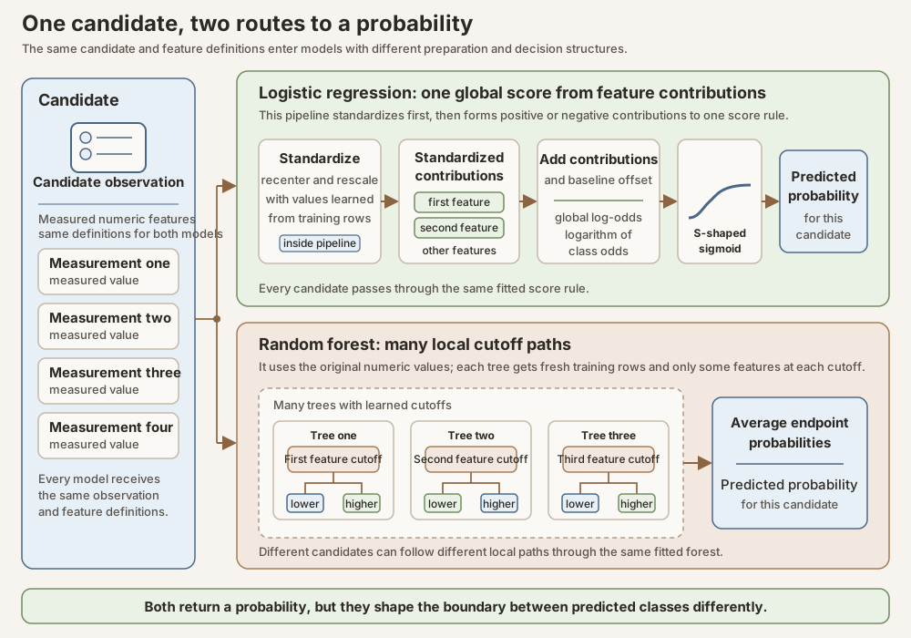
Scroll horizontally to inspect the diagram. The caption below provides a full text explanation.
A candidate is not a discovery
A pulsar is a rotating neutron star whose emitted beam can sweep past Earth as a repeating signal. Survey pipelines search large volumes of telescope data for signal patterns worth closer inspection. Terrestrial transmitters and instrumental effects can produce radio-frequency interference (RFI) that resembles part of that pattern, so candidate selection is a filtering problem, not a discovery certificate (Lyon and colleagues, 2016).
HTRU2 contains 17,898 human-checked candidates from the High Time Resolution Universe survey. One observation is one candidate row. HTRU2’s eight continuous features are numerical measurements that can take values across a range, derived from two summaries. The integrated pulse profile summarizes signal intensity across pulse phase, meaning position within one repeat of the pulse cycle. A dispersion correction adjusts for the frequency-dependent arrival delay caused by ionized material along the signal’s path. The dispersion-measure curve records the signal-to-noise ratio (SNR), a measure of signal strength relative to background variation, as different trial corrections are applied. The label records pulsar candidate or RFI/noise.
The release contains 1,639 pulsar examples and 16,259 non-pulsar examples, with
no missing cells. Before splitting, the generator confirmed eight numeric
features per row and found zero feature cells that were missing, infinite, or
NaN (“not a number”); zero rows that duplicated all eight feature values of
another row; and zero rows that duplicated both another row’s features and
label. The source table has no persistent row identifier, a stable ID that
would follow the same candidate across files or releases. The bundled table
and Readme do not declare physical measurement units for the eight derived
columns. These checks are recorded in the analysis
receipt, a machine-readable record of inputs
and results, and post-wide provenance manifest, a map
connecting published values to their source evidence. The release is available
under Creative Commons Attribution 4.0
(Lyon, HTRU2 at the University of California, Irvine (UCI) Machine Learning
Repository). Those counts mean that only 9.16 percent of rows
carry the positive label used here. That percentage is the positive-class
prevalence, the fraction of rows in the evaluated collection that are
positive.
The bundled HTRU2 Readme is the recorded authority for column order in this analysis. The generator follows that documented order and binds both the data file and Readme to their recorded Secure Hash Algorithm 256-bit (SHA-256) digests, digital file fingerprints used to verify that the exact inputs have not changed.
The first baseline is the class prevalence
Suppose a model declared every candidate to be non-pulsar. It would be correct on most rows because non-pulsars dominate this release. Its accuracy would look high while it recovered none of the positive candidates. That is why overall accuracy is not our headline measure.
Accuracy is not precision. Everyday English blends these words; the metrics do not.
| Term | Question it answers | Trap in HTRU2 |
|---|---|---|
| Accuracy | Of all candidates, what fraction got the right class label? | An always-negative classifier looks strong because most rows are negative. |
| Precision | Of candidates sent to review, what fraction are truly positive? | High precision with tiny recall can mean almost no pulsars recovered. |
| Recall (sensitivity) | Of the known positives, what fraction were recovered? | High recall with low precision floods the queue with false alarms. |
We will define each formally later. For now: when positives are uncommon, accuracy can celebrate a useless model, while precision and recall ask about the review queue and the missed positives.
A more honest first control is the prevalence-only predictor. Figures and receipts label it the dummy prior; that name is only a scikit-learn convention. It is not a Bayesian prior. It learns only one fact from the training rows: roughly 9.16 percent are labeled pulsar candidates. It then takes that base rate literally and assigns every held-out candidate the same predicted probability, about 0.0916. A candidate with a very signal-like profile and a candidate that looks like obvious noise receive exactly the same score because this control never examines their features.
Picture 100 comparable candidates. The dummy prior forecasts that roughly nine of them will be positive, but it has no way to say which nine. Every candidate is tied, so it cannot put promising candidates earlier in the review queue. Average precision (AP) summarizes whether precision stays high as a model works farther down that ranked queue and recovers more of the known positives. Here, precision is the share of reviewed candidates that are actually positive. AP ranges from zero to one, and higher is better. Because the dummy prior gives every row the same score, it supplies no ordering information and cannot concentrate positives near the front of the queue. Its HTRU2 AP therefore falls back to the held-out positive prevalence, 0.0916.
A second ranking measure used later is receiver operating characteristic area under the curve (ROC AUC). One concrete way to understand it is to draw one known positive candidate and one known negative candidate at random, then ask whether the model gave the positive candidate the higher score:
- If the positive candidate has the higher score, the model receives one point.
- If the negative candidate has the higher score, the model receives no points.
- If their scores are tied, the model receives half a point.
A perfect ranker wins every comparison and has ROC AUC 1.0000. A perfectly reversed ranker loses every comparison and has ROC AUC 0.0000. The dummy prior, however, gives both candidates exactly 0.0916, so every positive-versus-negative comparison is a tie. Half credit on every comparison is exactly 0.5000.
That 0.5000 does not mean 50 percent accuracy, and it does not come from the 9.16 percent positive rate. It means only that the model has supplied no information for ordering a positive candidate ahead of a negative one.
This is still a useful control: logistic regression and random forest should earn their complexity by improving on a predictor that knows only “about nine positives per hundred.” The baseline values are recorded in the analysis receipt and post-wide provenance manifest.
What this comparison adds
The underlying methods are established. Cox gave the foundational binary logistic formulation used by modern logistic regression (Cox, 1958). Recursive classification trees were developed in the classification and regression tree literature (Breiman and colleagues, 1984), and Breiman defined random forests as ensembles of randomized tree predictors (Breiman, 2001). This Deep Dive does not introduce a new model.
Its contribution is educational and procedural: one beginner-first path from the logistic model to its held-out results, then the forest, then a paired comparison, using one documented fitting-and-tuning workflow on two open datasets, with generated evidence kept separately for ranking, probability quality, and threshold decisions. It asks what each familiar structure earns on the same held-out rows and then checks whether the within-dataset conclusion changes in a second domain. It does not claim a benchmark record, an astronomical discovery, a biological mechanism, or universal superiority for either model family.
Separate fitting from held-out evaluation
Three terms matter here. Fitting means learning a model’s weights, thresholds, or other internal values from data. Tuning means comparing candidate settings, such as regularization strength or tree depth, using training-only validation. Regularization strength controls how strongly large model weights are discouraged, while tree depth limits how many branching levels a tree may use. Held-out evaluation means measuring the finished choice on reserved rows that served neither purpose.
Within the published workflow, held-out rows stay outside every choice learned or selected from the data. We split the raw rows before fitting a scale, choosing a regularization strength that controls the size of fitted weights, selecting forest settings, examining a reliability diagram that compares predicted probabilities with observed frequencies, or calculating the reported held-out measures.
The split is stratified, which means the training and test portions preserve approximately the same positive and negative class proportions. Within the training portion, cross-validation repeatedly divides the available rows into temporary fitting and validation folds. A fold is one such subset. The model learns on the temporary fitting folds and is scored on the matching validation fold. These internal comparisons select hyperparameter settings without consulting the final test labels.
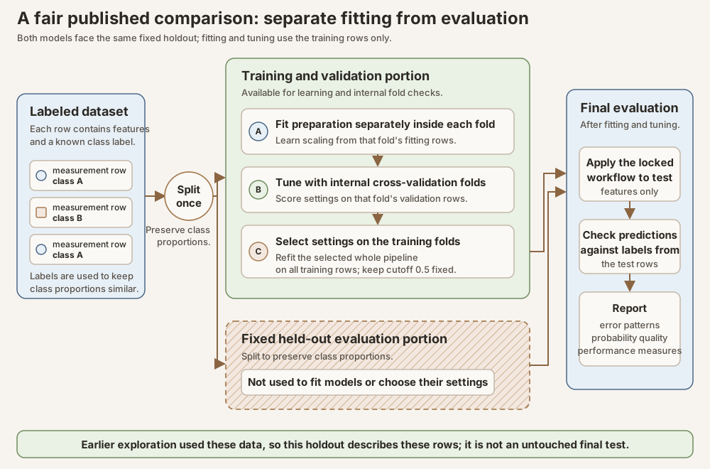
Scroll horizontally to inspect the diagram. The caption below provides a full text explanation.
This separation prevents data leakage, which means information from the evaluation target influences model development. Leakage can be obvious, such as training on a test label. It can also be subtle. Calculating a mean and standard deviation from the entire table before the split lets the test rows shape the logistic model’s input scale. Looking at the test precision and then changing a forest setting turns the test into another tuning set. Both produce an evaluation that is easier than the one the prose claims.
The fixed comparison
Both models will eventually receive the same feature definitions, initial split, internal folds, and scoring rules. Their data preparation differs only where their structures require it. We present the story in teaching order: logistic regression first, with its held-out results, then the forest, then a head-to-head on the same rows. The fairness contract that makes that final comparison meaningful is:
| Choice | Logistic regression | Random forest | Why it is fair |
|---|---|---|---|
| Input rows and labels | Same fixed rows | Same fixed rows | Both models are tested on exactly the same rows, so outcomes can be compared row by row; results could still differ under another split. |
| Numerical preparation | Standard scaling fitted inside each training fold | Original numerical values | Scaling matters to the regularized weighted score; tree thresholds depend on ordering rather than units. |
| Model selection | Training-only cross-validation over a small grid of regularization strengths | Training-only cross-validation over tree-depth and leaf-size settings | Both grids are selected using the same folds and the same average-precision objective. |
| Primary selection measure | Average precision on training-only folds | Average precision on the same folds | Both models optimize the same training-only objective. |
| Final probability | Sigmoid of one global score | Mean of reached leaf probabilities | These are probability outputs, not hard-vote fractions. |
| Final threshold view | The fixed 0.5 reference threshold | The same 0.5 threshold | Threshold conclusions are paired on the same held-out rows. |
No class weighting, synthetic minority oversampling, or resampling of positive rows enters the primary comparison. Class weighting changes how strongly mistakes on each class affect the fitting objective. Synthetic minority oversampling creates artificial positive training examples, while positive-row resampling repeats observed positives more often. Those methods can be useful for other goals, but they change which mistakes fitting emphasizes or how often the model sees each kind of row, which complicates interpretation of the raw probability output. Keeping the primary analysis simple makes the probability comparison easier to audit. It does not claim that this is the best operational training strategy.
Model one: logistic regression, one weighted score
Logistic regression begins with a compact idea. Each feature can push a candidate’s score upward or downward. The model learns one weight for each feature, adds the weighted contributions, and adds a baseline offset called the intercept. Every candidate is evaluated with that same global rule.
Because HTRU2 features have different numerical ranges, the logistic pipeline first applies standard scaling. Let \(x\) be one original feature value, \(\mu\) the mean learned for that feature from the current training rows, and \(s\) the corresponding training standard deviation, a measure of typical spread around the mean. We will call the resulting standardized value \(z\). Standard scaling computes:
\[ z = \frac{x-\mu}{s}. \]A value of \(z=1\) means the measurement sits one training standard deviation above the training mean. The transformation is fitted again inside each internal fold, so a validation row never helps define its own scale.
Let \(p\) denote the model’s predicted probability for the positive class. The odds are the predicted probability of the positive class divided by the predicted probability of the negative class:
\[ \mathrm{odds}=\frac{p}{1-p}. \]The log-odds, also called the logit, apply the natural logarithm \(\log\) (sometimes written \(\ln\)) to those odds:
\[ \mathrm{log\text{-}odds}=\log\left(\frac{p}{1-p}\right). \]Logistic regression models those log-odds with one weighted score. We will write that score as \(\eta\), pronounced eta, and its intercept as \(b\). There are \(m\) input features, with \(m=8\) in HTRU2. The index \(j\) identifies one feature, \(z_j\) is its standardized value, and \(w_j\) is its fitted weight. The summation symbol \(\sum\) means to add the \(m\) weighted contributions:
\[ \eta = b + \sum_{j=1}^{m} w_j z_j =\log\left(\frac{p}{1-p}\right). \]The score can be any real number. The sigmoid function bends it onto the interval from zero to one. Let \(y=1\) name the positive label, a pulsar candidate in HTRU2, and let \(z\) name the entire standardized feature row. The vertical bar \(\mid\) means “given.” The expression \(p(y=1\mid z)\) therefore means the predicted probability of the positive label given that row. The function \(\exp(a)\) raises the mathematical constant \(e\) to the power \(a\). With those symbols defined, the sigmoid is the inverse of the logit:
\[ p(y=1\mid z)=\frac{1}{1+\exp(-\eta)}. \]So \(\log(p/(1-p))\) and the sigmoid undo each other: the model fits on the log-odds scale, then reports a probability. A score of zero becomes a probability of one half. Larger scores become probabilities above one half, and smaller scores become probabilities below one half.
Toy walk-through (not HTRU2 data). Suppose a candidate has two standardized features \(z_1=1.0\) and \(z_2=-0.5\), with fitted intercept \(b=-0.2\) and weights \(w_1=0.8\), \(w_2=-0.4\). Then
\[ \eta = -0.2 + (0.8)(1.0) + (-0.4)(-0.5) = 0.8, \]and
\[ p = \frac{1}{1+\exp(-0.8)} \approx 0.69. \]So under this global rule the model would report about a 69 percent chance that the row is positive. Real HTRU2 fits use eight features and different numbers; the arithmetic is the same.
This map from features to score is an affine rule: one weighted sum plus an intercept. With two features, a constant-score boundary is a straight line. With eight features, the corresponding boundary is the seven-dimensional analogue of that straight line. We cannot draw it, but the important structural fact remains: the same weighted rule acts everywhere.
Regularization keeps the global rule from becoming too eager
Fitting logistic regression means choosing the intercept \(b\) and weights \(w_1,\ldots,w_m\) so the predicted probabilities match the training labels well. Without a brake, that search can push weights to extreme values that chase quirks of the training rows. Regularization is that brake: it adds an extra cost for large weights while the model is being fitted, so the optimizer has to trade “fit the labels” against “keep the weights modest.”
The fitted implementation uses L2 regularization. The name comes from the same L2 norm (Euclidean length) used in L2 normalization. For the weight vector \(w=(w_1,\ldots,w_m)\),
\[ \lVert w\rVert_2=\sqrt{\sum_{j=1}^{m}w_j^2}, \qquad \lVert w\rVert_2^2=\sum_{j=1}^{m}w_j^2. \]L2 regularization penalizes that squared length. It does not rescale the weights to length one; that rescaling job is L2 normalization. Squaring matters: a weight of \(2\) costs four times as much as a weight of \(1\) in the sum of squares, so very large coefficients are discouraged more than mildly large ones.
Let \(\lambda\), pronounced lambda, denote the conceptual strength of that penalty. \(\lambda\) is a scalar: one shared non-negative number for all feature weights in this setup, not a separate \(\lambda_j\) per feature and not a vector. The vector in the formula is \(w\). Write \(L_{\mathrm{fit}}\) for the training fit loss: a number that gets smaller when the predicted probabilities match the training labels better. In schematic form, the fitting objective is
\[ L_{\mathrm{fit}}+\lambda\sum_{j=1}^{m}w_j^2 =L_{\mathrm{fit}}+\lambda\lVert w\rVert_2^2. \]For a fixed \(\lambda\), the fitter searches for weights that make this whole expression small. It does not minimize \(L_{\mathrm{fit}}\) by itself. A change in the weights helps only when the improvement in training fit is worth the change in the penalty. Driving \(L_{\mathrm{fit}}\) a little lower by making \(\lVert w\rVert_2\) much larger can make the total objective worse.
Every feature weight enters the same sum and feels the same \(\lambda\). There is no dial that says “penalize \(w_3\) harder than \(w_7\).” The intercept \(b\) is the usual exception: it is often left out of the penalty, so \(\lambda\) pulls the feature weights toward zero while leaving the overall baseline log-odds freer to move.
What can differ across features is the fitted size of each \(w_j\). A feature that improves the label fit a lot can “earn” a larger \(|w_j|\) against the shared penalty. A feature that barely helps is cheaper to shrink toward zero. So one \(\lambda\) can leave uneven weights, but that unevenness comes from the data-fit tradeoff, not from per-weight lambdas.
- If \(\lambda\) is near zero, the shared penalty barely matters and weights can grow to chase the training labels.
- If \(\lambda\) is large, every feature weight becomes more expensive to keep large, so the fit is pulled toward smaller coefficients and a gentler score surface.
Exact software conventions differ, but the teaching idea is the same: larger \(\lambda\) means a stronger shared pull of the feature weights toward zero.
Scikit-learn does not ask you to set \(\lambda\) directly for this model. It
exposes an inverse knob called C. Conceptually,
(up to the package’s exact scaling constants). So the dial runs the other way:
| Knob | Stronger regularization | Weaker regularization |
|---|---|---|
| Conceptual \(\lambda\) | larger \(\lambda\) | smaller \(\lambda\) |
scikit-learn C |
smaller C |
larger C |
A small C is a tight leash: weights stay closer to zero. A large C loosens
the leash and lets the fit chase the training data more aggressively. The exact
parameterization is recorded in the locked code and version-matched official
documentation
(scikit-learn logistic-regression documentation).
\(\lambda\) (or C) is not a weight that the logistic solver invents the
way it invents \(w_j\). There are two different searches:
- Fit the weights for a fixed leash. Choose one
C. Given that fixed value, an optimizer searches for \(b\) and \(w\) that make \(L_{\mathrm{fit}}+\lambda\lVert w\rVert_2^2\) small on the training rows used for fitting. - Choose the leash on held-in validation rows. Try several candidate
Cvalues. For each candidate, fit on part of the training data and score the result on the remaining training folds. Pick theCwith the best training-only validation score. Then refit once on all training rows with that chosenC.
This Deep Dive uses average precision as that validation score and never looks
at the final holdout while choosing C. The locked grid and the selected
HTRU2 value appear later in the exact fitting contract.
Toy: how one shared C is chosen (numbers invented for teaching).
Imagine only the training rows, split into five folds. We try three leashes
and record mean validation average precision (AP; higher is better):
Candidate C |
Conceptual leash | Mean validation AP |
|---|---|---|
| \(0.01\) | tight (\(\lambda\) large) | \(0.80\) |
| \(1.0\) | medium | \(0.88\) |
| \(100.0\) | loose (\(\lambda\) small) | \(0.84\) |
The medium leash wins on the training-only folds, so we select C=1.0. Only
after that choice do we refit \(b\) and \(w\) on all training rows with
C=1.0. The final holdout is still untouched.
While C is fixed at \(1.0\), the weight fit can still leave uneven
\(|w_j|\). Suppose two candidate weight vectors give almost the same training
fit, but one is \(w=(0.5,0.5)\) and the other is \(w=(2.0,0.0)\). Their
squared lengths are \(0.50\) and \(4.0\). With one shared \(\lambda\), the
second pays a much larger penalty unless that large weight improves the label
fit enough to compensate. Useful features can earn larger coefficients;
useless ones are cheaper to shrink. The leash strength stays one number.
Regularization can improve stability, but it does not make coefficients causal. A positive coefficient says that, within this fitted model and holding its other inputs fixed, increasing that standardized feature increases the fitted log-odds. Correlated features can divide or exchange apparent contribution. A coefficient is not evidence that changing the measured property would cause a candidate to become a pulsar.
Fitting the logistic model on HTRU2
The locked path is the logistic / logistic_search block below, taken from
reproduce.py. Read the prose and the code as the same
object.
logisticis aPipeline: fold-fitted standard scaling (StandardScaler), then an L2-regularizedLogisticRegression.solver="lbfgs"is the limited-memory Broyden-Fletcher-Goldfarb-Shanno (L-BFGS) optimizer;max_iter=5_000caps its iterations;penalty="l2"is the shared-weight brake from the previous section;class_weight=Noneleaves class frequencies unweighted;random_state=logistic_seedis recorded for configuration consistency, though scikit-learn only uses it with thesag,saga, andliblinearsolvers, not withlbfgs. Repeatability of this fit rests instead on the fixed split, the fixed preprocessing, and the locked package and runtime versions.logistic_searchwraps that pipeline inGridSearchCV. Theparam_gridtriesCin{0.01, 0.1, 1.0, 10.0, 100.0};scoring="average_precision"is the training-only selection measure;cv=cv_splitsuses the fixed fold assignments created inreproduce.py(the forest will reuse the same folds later);refit=Truerefits the winningCon all training rows.
Those folds are not chosen by looking at held-out scores. After the initial
stratified 20 percent test split, reproduce.py builds five
training-only folds with scikit-learn’s StratifiedKFold: it shuffles the
training rows with a fixed random seed (20271093 for HTRU2), then cuts them
into five parts that keep roughly the same positive-class fraction in each
part. The script materializes that split list once as cv_splits and hands
the same list to both model searches, so logistic regression and the forest
see identical held-in fold boundaries. The folds decide which training rows
temporarily act as validation while C (and later forest settings) are
compared; they never include the final holdout.
forest-in-the-sky.ipynb is a launcher notebook
that downloads hash-checked bundle files, invokes the same generator, and
displays the generated figures.
logistic = Pipeline(
    steps=[
        ("scaler", StandardScaler()),
        (
            "classifier",
            LogisticRegression(
                solver="lbfgs",
                penalty="l2",
                class_weight=None,
                max_iter=5_000,
                random_state=logistic_seed,
            ),
        ),
    ]
)
logistic_search = GridSearchCV(
    logistic,
    param_grid={"classifier__C": [0.01, 0.1, 1.0, 10.0, 100.0]},
    scoring="average_precision",
    cv=cv_splits,
    refit=True,
    n_jobs=-1,
    return_train_score=False,
    error_score="raise",
)
On HTRU2, that search selected C=1.0. On Rice, the same protocol later
selects C=100.0; that second fit is discussed only in the transfer check.
Selection evidence: training-fold tuning
receipt, generator, and
provenance and verification.
Better at what?
Before looking at logistic results, we need measures that match the three jobs. A model can rank cases well while its probabilities are too extreme. It can estimate probabilities reasonably while a threshold of 0.5 creates an impractical review queue. One number cannot settle all three questions.
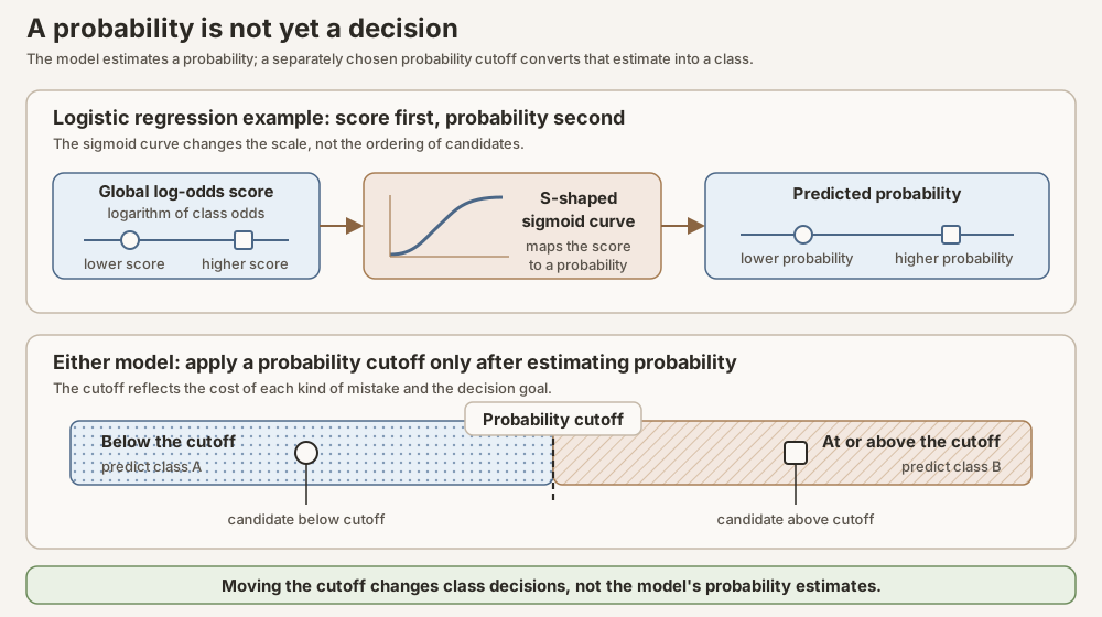
Scroll horizontally to inspect the diagram. The caption below provides a full text explanation.
Begin with the four outcomes of a threshold
A threshold is the cutoff a predicted probability has to reach before the row is acted on as a positive. Call it \(t\): a row is predicted positive when its probability \(p_i\) is at least \(t\), and negative otherwise. So “threshold 0.5” is shorthand for one rule, send every candidate the model rated at 0.5 or higher to the review queue and leave the rest alone. Nothing about the model changes when \(t\) changes; the probabilities stay exactly as they were, and only the line drawn through them moves.
We call 0.5 the reference threshold because it is a fixed convention for
reading the models side by side, not a result. The published code applies it
explicitly, as positive_probability >= 0.5, which normally agrees with what
scikit-learn’s predict returns for a binary classifier; the one boundary case
is an exact tie at 0.5, which predict resolves by class order and therefore
sends to the negative class. Holding one cutoff constant means the confusion
counts of the two models describe the same rule rather than two separately
tuned ones. It is not
optimal for anything. Half a chance of being a pulsar is not a statement about
what deserves telescope time, and a later section shows what other cutoffs
would cost.
Choose pulsar candidate as the positive class. Once a threshold turns probabilities into predicted classes, each held-out row has one of four outcomes:
| Outcome | Meaning in HTRU2 |
|---|---|
| True positive | A labeled pulsar candidate is sent to the positive class. |
| False positive | A labeled RFI/noise candidate is sent to the positive class. |
| True negative | A labeled RFI/noise candidate remains in the negative class. |
| False negative | A labeled pulsar candidate remains in the negative class. |
Recall asks what fraction of labeled positives were recovered:
\[ \mathrm{recall}=\frac{\mathrm{true\ positives}} {\mathrm{true\ positives}+\mathrm{false\ negatives}}. \]Precision asks what fraction of positive predictions were labeled positive:
\[ \mathrm{precision}=\frac{\mathrm{true\ positives}} {\mathrm{true\ positives}+\mathrm{false\ positives}}. \]As the threshold moves, recall and precision usually trade against each other. A precision-recall curve traces that relationship across many thresholds. We summarize it with average precision (AP). The precision inside AP is exactly the same \(\mathrm{TP}/(\mathrm{TP}+\mathrm{FP})\) already defined above, not a special dummy-only formula. What changes is the threshold.
Sort every candidate by the model’s predicted probability, from most likely positive to least likely. A candidate’s rank is its position in that sorted list: rank 1 is the candidate the model rated most likely to be positive, rank 2 the next most likely, and so on. Choosing the top \(k\) candidates for review is the same as setting a threshold that accepts exactly those \(k\) rows as positive predictions. For that cutoff:
- \(\mathrm{TP}\) = how many of those \(k\) rows are truly positive,
- \(\mathrm{FP}\) = how many of those \(k\) rows are truly negative,
- precision is still \(\mathrm{TP}/(\mathrm{TP}+\mathrm{FP})\),
- recall is still (positives found so far) / (all positives in the set).
Average precision walks down that ranked list and, each time a new true positive enters the review set, records the precision at that cutoff, then averages those precisions with weights equal to the recall gains. In plain language, it rewards a ranking that puts positives early and keeps \(\mathrm{TP}/(\mathrm{TP}+\mathrm{FP})\) high as more of the known positives are recovered. The number reported here is scikit-learn’s non-interpolated, recall-weighted average precision. A trapezoidal area under a precision-recall curve is a related but different summary, so we keep the name AP for the quantity actually computed.
If the ranking carries no real signal, meaning every candidate gets the same score or positives are sprinkled through the queue at random, then positives show up at roughly their overall rate. On HTRU2 that rate is about 9 in 100, the positive-class prevalence. Working down such a no-signal queue, about 9 percent of the reviewed candidates are positive no matter how far you go, so precision stays near 0.09 and AP stays near 0.09. That floor describes the prevalence-only dummy prior, not the fitted logistic model. Logistic regression will later post AP near 0.91 on this holdout; the dummy bar is plotted beside it as the no-signal baseline those fitted models must beat (Davis and Goadrich, 2006; scikit-learn average-precision documentation).
Tiny AP ranking example (toy, not HTRU2). Same precision formula as above, applied to cutoffs on a tiny ranked queue. The model has scored five candidates, and we sort them by that score: rank 1 is the candidate the model rated most likely to be positive, rank 5 the least likely. The true labels tell us how good that guessed ordering actually was:
There are two positives in the whole list. Stopping after rank \(k\) means: everyone in ranks \(1\) through \(k\) is a positive prediction; everyone below is left negative. That is one threshold. Precision at that threshold is still \(\mathrm{TP}/(\mathrm{TP}+\mathrm{FP})\), and recall is still positives found divided by the 2 positives that exist.
| Rank | True label | Review set if we stop here | \(\mathrm{TP}\) | \(\mathrm{FP}\) | Precision | Recall | Recall gain | Running AP |
|---|---|---|---|---|---|---|---|---|
| 1 | positive | ranks 1 | 1 | 0 | \(1/1=1.00\) | \(1/2=0.50\) | \(+0.50\) | \(0.50\) |
| 2 | negative | ranks 1 to 2 | 1 | 1 | \(1/2=0.50\) | \(1/2=0.50\) | \(0\) | \(0.50\) |
| 3 | positive | ranks 1 to 3 | 2 | 1 | \(2/3\approx0.67\) | \(2/2=1.00\) | \(+0.50\) | \(0.83\) |
| 4 | negative | ranks 1 to 4 | 2 | 2 | \(2/4=0.50\) | \(2/2=1.00\) | \(0\) | \(0.83\) |
| 5 | negative | ranks 1 to 5 | 2 | 3 | \(2/5=0.40\) | \(2/2=1.00\) | \(0\) | \(0.83\) |
The running AP column is the tally so far: each row adds (precision at this cutoff) \(\times\) (recall gain at this cutoff). Rows whose recall gain is \(0\) add nothing, so the tally only moves at ranks 1 and 3. The final value in that column, \(0.83\), is the AP for this ranking.
Working the two contributing rows in full:
-
Stop after rank 1 (just included a positive).
Positive predictions: {rank 1}.
\(\mathrm{TP}=1\), \(\mathrm{FP}=0\), so \(\mathrm{precision}=1/(1+0)=1.00\).
Positives found: 1 of 2, so \(\mathrm{recall}=1/2=0.50\), a gain of \(0.50\). Contribution: \((1.00)(0.50)=0.50\). -
Stop after rank 3 (just included the second positive).
Positive predictions: {ranks 1, 2, 3} = positive, negative, positive.
\(\mathrm{TP}=2\), \(\mathrm{FP}=1\), so \(\mathrm{precision}=2/(2+1)=2/3\approx0.67\).
Positives found: 2 of 2, so \(\mathrm{recall}=2/2=1.00\), another gain of \(0.50\). Contribution: \((0.67)(0.50)\approx0.33\).
The zero-gain rows are still legitimate thresholds with their own precision values; they simply add nothing to the tally. The negative at rank 2 still matters, though: it sits inside the review set when we reach rank 3, which is why that precision is \(2/3\) rather than \(2/2\).
Adding the two contributions gives the value in the last cell of the table:
\[ \mathrm{AP}= (1.00)(0.50)+(0.67)(0.50)\approx 0.83. \]This toy is a skilled ranking, not the dummy prior. The dummy prior ties every score, so it cannot put positives early; its AP stays near the positive rate. Real HTRU2 AP uses thousands of rows; the arithmetic idea is the same.
A receiver operating characteristic (ROC) curve traces true-positive rate, or recall, against the false-positive rate, the fraction of labeled negatives incorrectly sent to the positive class, across thresholds. The receiver operating characteristic area under the curve (ROC AUC) summarizes ranking from that view. ROC AUC remains useful, but when negatives greatly outnumber positives, even a small false-positive rate can still put many false alarms in the review queue. ROC AUC does not show that count directly. We show it beside AP rather than letting it replace AP (scikit-learn model-evaluation documentation).
Both summaries can be drawn for the same five-candidate toy used above, which makes their different emphases easier to see side by side.
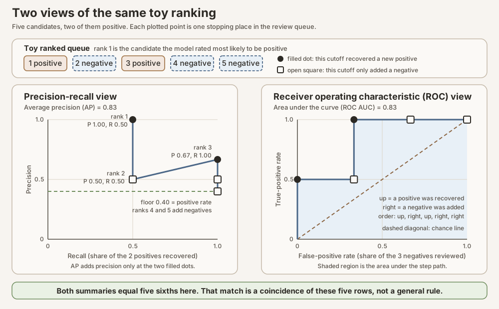
Scroll horizontally to inspect the diagram. The caption below provides a full text explanation.
Balanced accuracy averages recall for the positive class and recall for the negative class, meaning the fraction of labeled negatives correctly rejected. Each class therefore contributes equally even when their row counts differ. We report it at the reference threshold of 0.5, and we publish the threshold-specific confusion counts beside it.
Confusion counts are the four tallies from the outcome table above: true positives, false positives, true negatives, and false negatives. Arranged as a two-by-two grid of predicted class against true label, that set of four is usually called a confusion matrix. They are threshold-specific because they do not exist until a threshold has turned probabilities into class decisions. One fitted model, left completely unchanged, produces a different set of four counts at every threshold you might choose, and every rate in the table below is computed from whichever set of four you are looking at. So the phrase means nothing more than “the four outcome tallies at one stated threshold.” Quoting a rate without them hides both the threshold that produced it and the review workload it implies: a balanced accuracy of 0.91 does not tell you whether reviewers face 19 false alarms or 1,900.
Metric reference (one threshold versus a whole ranking). Fix a threshold first. Using the four counts above:
| Name | Formula idea | Plain HTRU2 question |
|---|---|---|
| Accuracy | \((\mathrm{TP}+\mathrm{TN})/n\) | How often is the class label right overall? |
| Precision | \(\mathrm{TP}/(\mathrm{TP}+\mathrm{FP})\) | Of the review pile, how many are real positives? |
| Recall / sensitivity / true-positive rate | \(\mathrm{TP}/(\mathrm{TP}+\mathrm{FN})\) | Of known positives, how many did we catch? |
| Specificity / true-negative rate | \(\mathrm{TN}/(\mathrm{TN}+\mathrm{FP})\) | Of known negatives, how many did we correctly leave alone? |
| False-positive rate | \(\mathrm{FP}/(\mathrm{FP}+\mathrm{TN})=1-\mathrm{specificity}\) | Of known negatives, what fraction became false alarms? |
| Balanced accuracy | \((\mathrm{recall}+\mathrm{specificity})/2\) | Average of the two class-wise hit rates, so the rare class is not drowned. |
None of those is a ranking summary. When the threshold moves, the counts change. Average precision (AP) and ROC AUC summarize behavior across many thresholds (or, equivalently, across the score order):
| Ranking summary | Emphasizes | Why we care here |
|---|---|---|
| AP | Precision as recall grows down the ranked queue | Matches an uncommon-positive review queue. |
| ROC AUC | Ranking of random positive–negative pairs | Useful, but a small false-positive rate can still mean many false alarms when negatives dominate. |
This Deep Dive does not use F1 (the harmonic mean of precision and recall at one threshold) as a headline. One F1 number can hide which side of the precision–recall tradeoff moved. We keep the confusion counts visible instead.
Probability scores judge the whole numerical prediction
For row \(i\), let \(p_i\) be the predicted positive-class probability and let \(y_i\) equal one for a positive label and zero for a negative label. With \(n\) held-out rows, the Brier loss used here is the mean squared probability error:
\[ \mathrm{Brier}=\frac{1}{n}\sum_{i=1}^{n}(p_i-y_i)^2. \]Lower is better. Some writers call the same quantity the Brier score. This Deep Dive uses Brier loss everywhere so “lower is better” stays unambiguous; when an older figure caption or receipt says “Brier score,” read it as this same mean squared error. Brier loss rewards probability estimates near the observed labels and penalizes estimates farther away (Brier, 1950).
It is not a calibration certificate. The single number also absorbs how common the outcome is and how far apart the model managed to push the two classes, so a lower Brier loss can come from better calibration, from sharper separation, or from an easier base rate. The exact three-way split into reliability, resolution, and uncertainty (Murphy, 1973), worked through on a checkable toy, is in the Brier loss glossary entry. One consequence of that split matters immediately here. A forecaster that ignores the features and repeats one constant \(q\) on every row scores
\[ \mathrm{Brier}=\bar o(1-q)^2+(1-\bar o)q^2=\bar o(1-\bar o)+(q-\bar o)^2, \]where \(\bar o\) is the held-out positive rate. The clean identity \(\bar o(1-\bar o)\) therefore applies only to a constant set at the evaluation set’s own rate. The dummy prior in this study is honest instead: it learned \(q=0.0915631\) from the training rows, before the holdout was touched. The holdout then turned out to have \(\bar o=0.0916201\), so the second term is about \(3\times 10^{-9}\) and the Brier loss is 0.0832259, published as 0.0832. A fitted model has to beat that number before its probabilities are worth more than the base rate, although a model could still improve the ranking without improving this score.
Log loss, also called negative log likelihood for this binary setting, penalizes confident errors especially strongly. The operator \(\log\) below is the natural logarithm:
\[ \mathrm{log\ loss}=-\frac{1}{n}\sum_{i=1}^{n} \left[y_i\log(p_i)+(1-y_i)\log(1-p_i)\right]. \]Lower is better. Only one of the two bracketed terms is alive on any given row, because \(y_i\) is either one or zero: a positive row is charged \(-\log(p_i)\) and a negative row is charged \(-\log(1-p_i)\). Both branches say the same thing, that each row pays the negative logarithm of the probability the model put on what actually happened. Being right and sure is nearly free, while being wrong and sure has no ceiling. A row scored 0.50 costs 0.69 whichever way it lands; a row scored 0.01 that turns out positive costs 4.61, and one scored 0.001 costs 6.91. A handful of confidently wrong rows can therefore move log loss noticeably while barely touching accuracy. The penalty curve, the clipping that keeps a single row from making the average infinite, and the comparison with Brier’s bounded penalty are drawn in the log loss glossary entry (scikit-learn model-evaluation documentation).
Log loss has the same kind of no-skill anchor, with the same small caveat. A constant forecast \(q\) scores \(-[\bar o\log q+(1-\bar o)\log(1-q)]\), which collapses to \(-[\bar o\log\bar o+(1-\bar o)\log(1-\bar o)]\), the entropy of the label distribution, only when \(q\) equals the held-out rate. The dummy prior’s published 0.3063 is the version evaluated at its training-set constant \(q=0.0915631\); the holdout’s own entropy is 0.3062702 and the two differ in the eighth decimal.
Both Brier loss and log loss are strictly proper scoring rules. That is a property of the measure, not of either model: a scoring rule is proper when the lowest expected score is obtained by reporting, for each row, the actual probability that the row is positive, and strictly proper when nothing else reaches that minimum. Take a group of candidates that truly go positive 70 percent of the time. A model that outputs 0.70 for them earns a better expected Brier loss and log loss than one that outputs 0.50 to look cautious or 0.99 to look decisive, and the same holds for every other group. There is no way to post-process probabilities into better scores without moving them closer to the rates that actually occur (Gneiting and Raftery, 2007). Both glossary entries work that guarantee through a small table of expected penalties.
That is the second reason to report these two scores beside AP. AP and ROC AUC read only the order of the scores, so they would not notice if every predicted probability were squashed into a narrow band or stretched toward the extremes. Brier loss and log loss grade the stated numbers themselves.
Finally, a model is calibrated when its stated probabilities match observed frequencies. For example, among many candidates assigned probability 0.20, roughly 20 percent should be positive. A reliability diagram groups similar predictions into bins and compares each bin’s average predicted probability with its observed positive fraction. A perfectly aligned curve would follow the diagonal, but finite bin counts make the display noisy and the picture depends on binning choices. It is a diagnostic, not a standalone certificate that a model is calibrated (Niculescu-Mizil and Caruana, 2005). The implementation and binning conventions are tied to the locked scikit-learn version (scikit-learn calibration documentation).
The primary HTRU2 metric is AP because the positive class is uncommon and the candidate-ranking problem matters. ROC AUC, balanced accuracy at 0.5, Brier loss, log loss, reliability curves, and threshold workload are secondary views with different jobs. When both models are on the table later, we will not crown a winner by counting how many columns each wins.
Model one on the HTRU2 holdout
The fitted logistic pipeline never saw the 3,580 fixed held-out HTRU2 rows
during scaling, C selection, or final refitting. Those rows are the first
place we ask what the global weighted score earned against the prevalence-only
control.
Evidence: analysis receipt, generator, and provenance and verification.
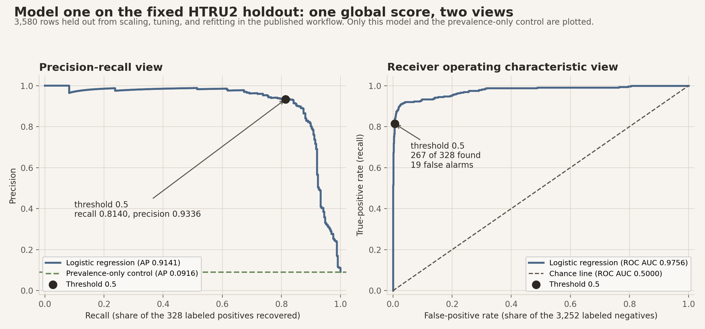
Read those numbers as a model-versus-baseline story, not yet as a model-versus-model contest. What matters here is the jump from prevalence-only guessing to a single standardized weighted score. The figure below draws the two views the five-candidate toy introduced, now on all 3,580 held-out rows and for logistic regression alone. Shared figures later in the page will place a forest bar beside the logistic one; ignore that bar until the forest has been introduced.
Scroll horizontally to inspect the diagram. The caption below provides a full text explanation.
On ranking, AP 0.9141 means the logistic queue concentrates labeled positives far earlier than chance under HTRU2’s uncommon positive class. ROC AUC 0.9756 says the same model also ranks a random positive ahead of a random negative most of the time. On probability quality, Brier loss 0.0184 and log loss 0.0784 are much smaller than the dummy prior’s 0.0832 and 0.3063. In the large lowest-probability reliability bin, 3,204 logistic rows averaged predicted probability 0.0123 against an observed positive fraction 0.0097; in the highest bin, 221 rows averaged 0.9901 against 0.9774. Middle bins are sparse and noisy. Under the 0.5 cutoff, meaning every candidate whose predicted probability is 0.5 or higher is sent to the review queue, those counts show a usable but incomplete recovery of the positive class, with a modest false-positive load.
That is a strong showing for one global affine rule. The open question is whether many local tree partitions can do still better on the same rows, or whether they mostly rearrange a gap the logistic model has already closed.
Model two: random forest, many local boxes
Model one committed to one weighted score for the whole sky. Model two gives that up. Instead of asking every candidate the same question, it asks a sequence of questions in which each answer decides what gets asked next, and it does that hundreds of times over.
One tree: a chain of cutoff questions
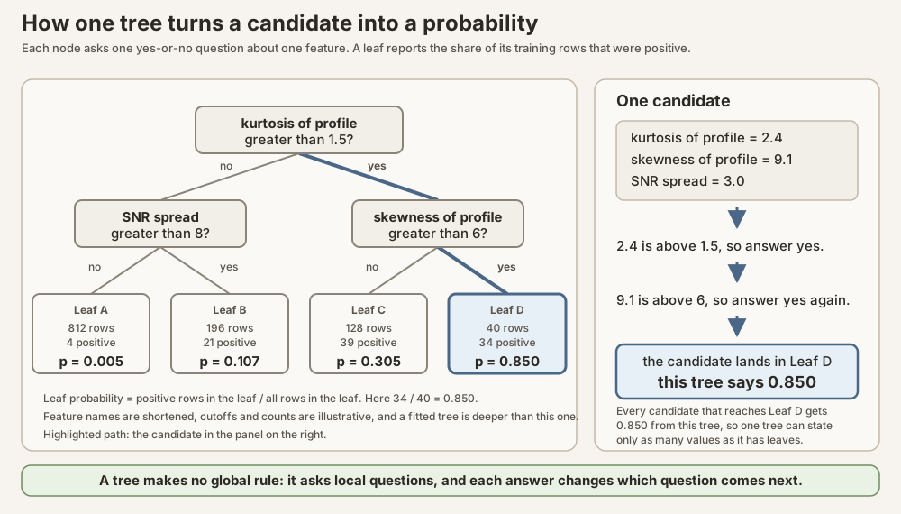
A decision tree asks a sequence of yes-or-no questions, each of the form “is this one feature above this one value?” That is the recursive partitioning idea: split the training rows into two groups with a feature cutoff, then split each group again, and keep going (Breiman and colleagues, 1984). A group that is never split again is a leaf.
Once the tree is grown, using it is mechanical. A new candidate enters at the top, answers whichever question it meets, and follows the matching branch until it arrives at a leaf. For classification in the unweighted implementation used here, the tree’s probability for that candidate is the fraction of the training rows sitting in that leaf that were positive (scikit-learn random-forest documentation).
Scroll horizontally to inspect the diagram. The caption below provides a full text explanation.
How a tree picks its cutoffs
Nothing so far says which question to ask. The fitted forest here uses the Gini impurity criterion, which scores how mixed the labels are inside a group. If a fraction \(q\) of a group is positive, its impurity is
\[ G=1-q^2-(1-q)^2=2q(1-q). \]That is 0 when a group is all positive or all negative, and it is largest, 0.5, at an even mix. It is the same \(q(1-q)\) shape that appeared as the uncertainty term inside a Brier loss, for the same reason: both measure how unsettled an outcome is before anything else is known. The binary formula, the multiclass form, and the entropy alternative are spelled out in the Gini impurity glossary entry.
Choosing between two candidate cutoffs (toy). A group holds 100 training rows, 30 of them positive, so \(q=0.30\) and its impurity is \(2(0.30)(0.70)=0.42\). The tree tries every allowed cutoff on every feature it is offered and keeps the one that lowers impurity the most, where the impurity after a split is the average of the two child impurities weighted by how many rows land in each.
| Candidate cutoff | Left child | Right child | Impurity after the split | Improvement |
|---|---|---|---|---|
| Cutoff A | 50 rows, 5 positive, \(G=0.18\) | 50 rows, 25 positive, \(G=0.50\) | \(0.5(0.18)+0.5(0.50)=0.34\) | 0.08 |
| Cutoff B | 50 rows, 15 positive, \(G=0.42\) | 50 rows, 15 positive, \(G=0.42\) | \(0.5(0.42)+0.5(0.42)=0.42\) | 0.00 |
Cutoff A is kept. It has pulled most of the positives to one side, so each child is purer than the parent. Cutoff B splits the group in half without sorting the labels at all: both children look exactly like the parent, the improvement is zero, and the question was worthless. Growing a tree is that comparison repeated at every node until a stopping rule bites.
The stopping rules are where the knobs live. max_depth caps how many
questions can be chained together. min_samples_leaf sets the smallest group a
leaf may contain, which matters because a leaf of 3 rows can only report 0,
1/3, 2/3, or 1, and would change wildly if a couple of training rows were
different. Small leaves capture local detail and produce rough, unstable
probabilities. Larger leaves are steadier and blur detail. Both values are
chosen by training-only validation, never from the test curves.
What boxes can do that one straight line cannot
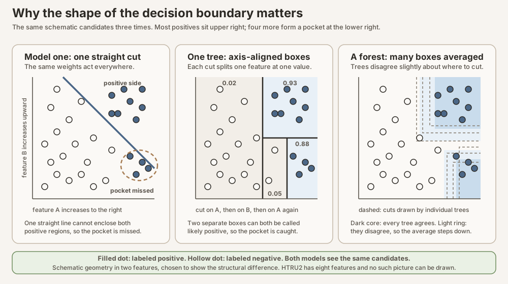
Because each question splits one feature at one value, a tree’s leaves are axis-aligned boxes in feature space, and the probability is piecewise constant: flat inside each box, with a hard step at the edge. Logistic regression’s boundary is one straight cut across the whole space. The difference is not cosmetic.
Scroll horizontally to inspect the diagram. The caption below provides a full text explanation.
The pocket in that figure is an interaction: a pattern where the useful meaning of one feature depends on the value of another. Logistic regression can represent one only if an analyst anticipates it and adds the matching product term or transformation by hand. A tree can find it by accident, because after the first split it is already looking at a subgroup and can ask a different question there. That is the structural bet this Deep Dive is testing on HTRU2.
From one tree to a forest
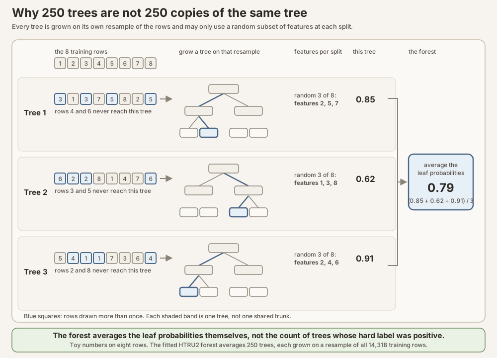
A single deep tree pays for that flexibility. Grown far enough it will isolate individual training rows, following accidents of the sample that will not repeat. A random forest keeps the flexibility and damps the instability by fitting an ensemble, a collection of models whose predictions are combined (Breiman, 2001). Two deliberate injections of randomness keep its trees from being near-copies of each other:
- Different rows. Each tree is grown on its own bootstrap sample, a same-size draw from the training rows made with replacement, meaning a selected row goes back in the pool and can be drawn again. Some rows appear two or three times in one tree’s sample and others not at all.
- Different features. At every split, the tree may only choose among a random subset of the features rather than all of them. A feature that dominates the first tree may simply not be offered when the tenth tree picks its root question.
Scroll horizontally to inspect the diagram. The caption below provides a full text explanation.
Writing that average down: let \(T\) be the number of fitted trees, let \(t\) index one of them, and let \(p_t\) be the leaf probability tree \(t\) returns for a given candidate. The forest’s estimate \(\hat p_{\mathrm{forest}}\) is the mean of those \(T\) numbers, where \(\sum\) means “add up”:
\[ \hat p_{\mathrm{forest}}=\frac{1}{T}\sum_{t=1}^{T}p_t. \]Averaging is what buys the stability. Each tree’s leaf probability carries some error that comes from its particular resample, and those errors are not identical across trees because the resamples and the offered features are not identical. Averaging numbers whose errors point in different directions leaves a steadier number than any one of them, which is why a forest’s probabilities move less than a single tree’s when the training rows change. What averaging does not do is remove a tendency the trees share. If every tree is systematically too eager in some region, the average is too eager there as well, and no number of extra trees will fix it.
One warning about vocabulary before we fit anything. The word bootstrap is about to be used for a second, completely different purpose later in this Deep Dive, and readers who meet both uses without noticing the switch tend to draw the wrong conclusion from the second one.
Both uses share one mechanic, drawing a same-size sample with replacement, and nothing else. The bootstrap described above is part of how the forest is built: it resamples the 14,318 training rows once per tree, and its output is the 250 trees themselves. The bootstrap in the comparison section is part of how the finished models are measured: it resamples the 3,580 held-out rows after both models are already fitted and frozen, and its output is an interval around the gap between them.
| Training bootstrap (this section) | Paired bootstrap (comparison section) | |
|---|---|---|
| Which rows are redrawn | The 14,318 training rows | The 3,580 held-out rows |
| When it happens | While the forest is being fitted | After both models are fitted and frozen |
| Why | To make 250 trees that differ from one another | To see how much the observed forest-minus-logistic gap moves when the test rows are redrawn |
| What comes out | The forest itself | A stability interval around a difference |
| Paired? | No, each tree draws independently | Yes, a drawn row brings both models’ predictions with it |
The pairing in the second use is what makes it a fair comparison: because both models are scored on the identical resampled rows every time, a row that happens to be easy or hard helps or hurts both of them together, and what survives is the difference between them rather than the luck of the draw.
Two things follow from keeping the uses apart. The forest’s internal resampling says nothing about how certain the eventual comparison is, and the later interval involves no refitting at all, so it describes variability in the test rows given these two fitted models rather than variability from training them again.
Fitting the forest on HTRU2
The locked forest path is the forest / forest_search block below, again
from reproduce.py. It uses the same cv_splits and the same
scoring="average_precision" objective as logistic_search, but there is no
scaler pipeline: tree thresholds use the original numerical features.
Every argument below is one of the choices described above, spelled the way scikit-learn spells it.
forestis aRandomForestClassifierwithn_estimators=250trees,criterion="gini"(choose each cutoff by the Gini-impurity improvement worked through earlier),bootstrap=True(each tree gets its own same-size resample drawn with replacement),class_weight=None(rare positives get no extra weight),random_state=forest_seedso the resampling and feature draws repeat exactly, andn_jobs=1.forest_searchis theGridSearchCVover that forest. Itsparam_gridtriesmax_depthin{6, 12, None}(Nonemeans grow until the stopping rules bite),min_samples_leafin{1, 5}(the smallest group a leaf may hold), andmax_featuresin{"sqrt", 0.75}, which sets how many features are offered at each split. In the locked scikit-learn version,"sqrt"takes the square root of the feature count and truncates it to a whole number, at least one, so it offers 2 of HTRU2’s 8 features and 2 of Rice’s 7. A value of0.75truncates 75 percent of the count in the same way, so 6 of 8 for HTRU2 and 5 of 7 for Rice. As with logistic regression,refit=Truerefits the winning settings on all training rows.
forest = RandomForestClassifier(
    n_estimators=250,
    criterion="gini",
    bootstrap=True,
    class_weight=None,
    random_state=forest_seed,
    n_jobs=1,
)
forest_search = GridSearchCV(
    forest,
    param_grid={
        "max_depth": [6, 12, None],
        "min_samples_leaf": [1, 5],
        "max_features": ["sqrt", 0.75],
    },
    scoring="average_precision",
    cv=cv_splits,
    refit=True,
    n_jobs=-1,
    return_train_score=False,
    error_score="raise",
)
On HTRU2, that search selected max_depth=6, max_features=0.75, and
min_samples_leaf=5. In words: the validation folds preferred shallow trees of
at most six chained questions, no leaf smaller than five training rows, and six
of the eight features offered at each split. That is a fairly restrained
forest, not a maximally flexible one. On Rice, the same protocol later selects
max_depth=6, max_features="sqrt", and min_samples_leaf=5, which offers
each split only 2 of the 7 features and so builds a more varied set of trees.
Selection
evidence:
training-fold tuning receipt,
generator, and provenance and verification.
Model two on the HTRU2 holdout
The fitted forest is evaluated on the same 3,580 held-out rows already used for the logistic report. Scaling still does not enter: tree thresholds use the original numerical features.
Evidence: analysis receipt, generator, and provenance and verification.
The forest gets the same two views, drawn the same way on the same rows, so the shapes can be compared by eye before any paired interval is computed.
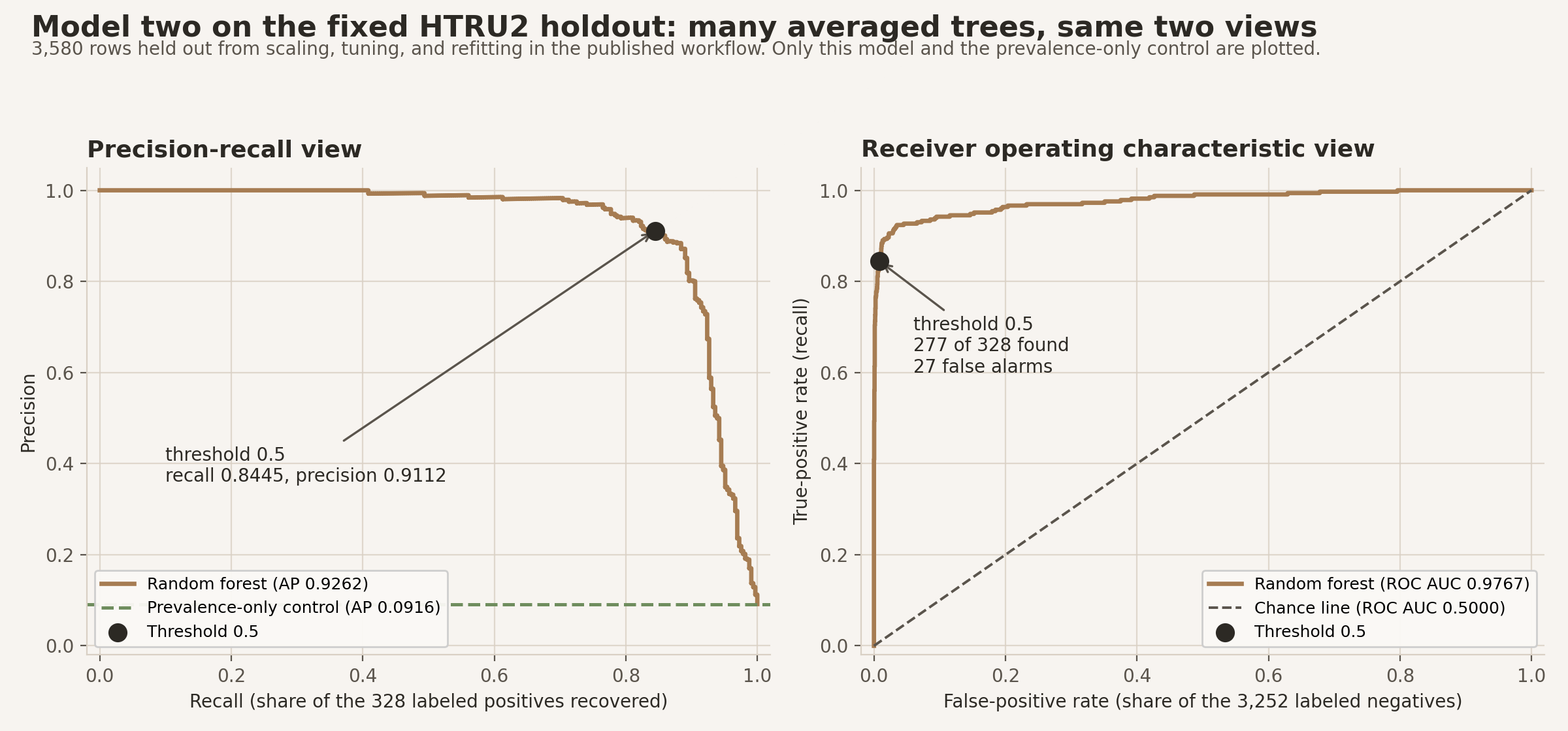
Scroll horizontally to inspect the diagram. The caption below provides a full text explanation.
Relative to the prevalence-only control, the forest also clears a large gap on ranking and probability scores. Relative to the logistic model just reported, the forest point estimates are a little higher on AP and ROC AUC, a little lower on Brier loss and log loss, and a little more aggressive at threshold 0.5 (10 more true positives and 8 more false positives). Those gaps are small beside the leap both models make over the dummy prior. The next section asks whether the forest-versus-logistic gaps are stable under fixed-test resampling.
Head-to-head on the same HTRU2 holdout
Both fitted models are now on the table, scored on exactly the same 3,580 held-out rows. Neither model saw those rows while its scaler was fitted, its hyperparameters were chosen, or its final version was refit. That makes the comparison fair between the two models, but it does not make this study a prospective confirmation experiment, a test whose dataset, model choices, and success criteria are all fixed in advance and examined only once. Earlier exploratory screening happened before the published workflow, so read what follows as a careful measurement rather than as a confirmed hypothesis.
The forest scored higher than the logistic model on this holdout. The question this section answers is narrower than it might appear: not whether forests beat logistic regression in general, and not even whether this forest would beat this logistic model on new pulsar candidates, but whether the gap we just measured is large enough to survive shuffling the very rows it was measured on.
Reading a score and its bracket
Each score below appears twice over: a bare number, then a bracketed range attached to the forest-minus-logistic difference.
The bare number is a point estimate, computed once from the 3,580 held-out rows exactly as they are. AP 0.9262 for the forest is a point estimate.
The bracket is a fixed-test stability interval, and it is built like this. Take the held-out rows and draw a new same-size test set from them with replacement, so some rows appear twice or three times and others drop out. Do that separately within each class, drawing 328 positives from the 328 positives and 3,252 negatives from the 3,252 negatives, which keeps every resampled test set at the same positive rate as the original (class stratified). Score both models on that resampled set and record the forest-minus-logistic difference. Repeat 2,000 times, sort the 2,000 differences, and report the 2.5th and 97.5th percentiles as the bracket.
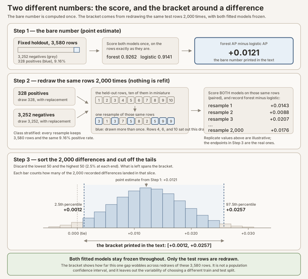
Scroll horizontally to inspect the diagram. The caption below provides a full text explanation.
Two details do the real work. Both models are always scored on the identical resampled rows, which is what paired means: an unusually easy or hard row helps or hurts both models at once, so it largely cancels out of their difference. And nothing is refit at any point. The two fitted models are frozen throughout; only the test rows move.
So the bracket answers exactly one question: how much would this gap wobble if the same 3,580-row test set had happened to contain a slightly different draw of these same rows? It is not a population confidence interval, it says nothing about future candidates from a different survey, and because no refitting occurs, it excludes the variability that would come from training the models on a different split.
How to read a forest−logistic interval (sign decoder). Every difference in the receipts is random forest minus logistic regression on the same held-out rows.
| Quantity | Sign that favors the forest in these resamples | Sign that favors logistic |
|---|---|---|
| AP, ROC AUC, balanced accuracy (higher better) | Interval entirely above zero | Interval entirely below zero |
| Brier loss, log loss (lower better) | Interval entirely below zero | Interval entirely above zero |
If the interval crosses zero, these fixed-test resamples leave either ordering possible (or essentially no difference). These brackets are not p-values, and they are not population confidence intervals for a new survey. They answer a narrower question: how stable is this one-test-set gap under redraws of its rows?
Headline evidence: analysis receipt, generator, and provenance and verification.
Ranking the candidate queue
![Held-out HTRU2 average precision is 0.0916 for the dummy prior, 0.9141 for logistic regression, and 0.9262 for random forest; the forest-minus-logistic difference is +0.0121 with fixed-test stability interval [+0.0012, +0.0257]. HTRU2 ROC AUC is 0.5000, 0.9756, and 0.9767, respectively; the paired difference is +0.0011 [-0.0031, +0.0054]. Held-out Rice average precision is 0.4278, 0.9643, and 0.9607; the paired difference is -0.0036 [-0.0073, +0.0002]. Rice ROC AUC is 0.5000, 0.9688, and 0.9648; the paired difference is -0.0040 [-0.0070, -0.0011]. Intervals resample each fixed test set within class and are not population confidence intervals.](/blog/knowledge-base/deep-dives/logistic-regression-random-forest/fig-held-out-ranking-metrics.png)
Scroll horizontally to inspect the diagram. The caption below provides a full text explanation.
The precision-recall panel asks the practical ranking question: as more candidates enter the review queue, what fraction of the retrieved candidates are labeled positives, and what fraction of all labeled positives have been recovered? On these HTRU2 rows, random forest had AP 0.9262 and logistic regression had AP 0.9141, compared with 0.0916 for the feature-free prior. Their paired forest-minus-logistic AP difference was +0.0121 [+0.0012, +0.0257]. ROC AUC was 0.9767 for the forest and 0.9756 for logistic regression, a much smaller difference of +0.0011 [-0.0031, +0.0054]. This is not a contradiction. AP emphasizes the precision-recall tradeoff under HTRU2’s uncommon positive class, while ROC AUC averages ranking behavior across positive-negative pairs. The fixed-test interval for the ROC AUC difference stretches below and above zero, so these resamples leave either model ordering possible.
The uncertainty bars come from a paired test-row bootstrap. On each resample, the same held-out row indices are drawn for both models, with replacement, and the metric difference is recomputed. A row may therefore appear several times in one resample while another is absent. Pairing preserves the fact that both models faced the same candidates. The resampling treats held-out rows as exchangeable within class for this stability check: after conditioning on class counts, any redraw of those rows is treated as informative about sensitivity to which rows appear in this test set. That is a local working assumption for the fixed holdout, not a claim that candidates are independent and identically distributed draws from a future survey, telescope, or acquisition process. Missing group identifiers prevent us from checking dependence across beams, nights, or instruments. The intervals are not p-values and do not establish performance on a new survey (Efron, 1979).
Are the probabilities useful as probabilities?
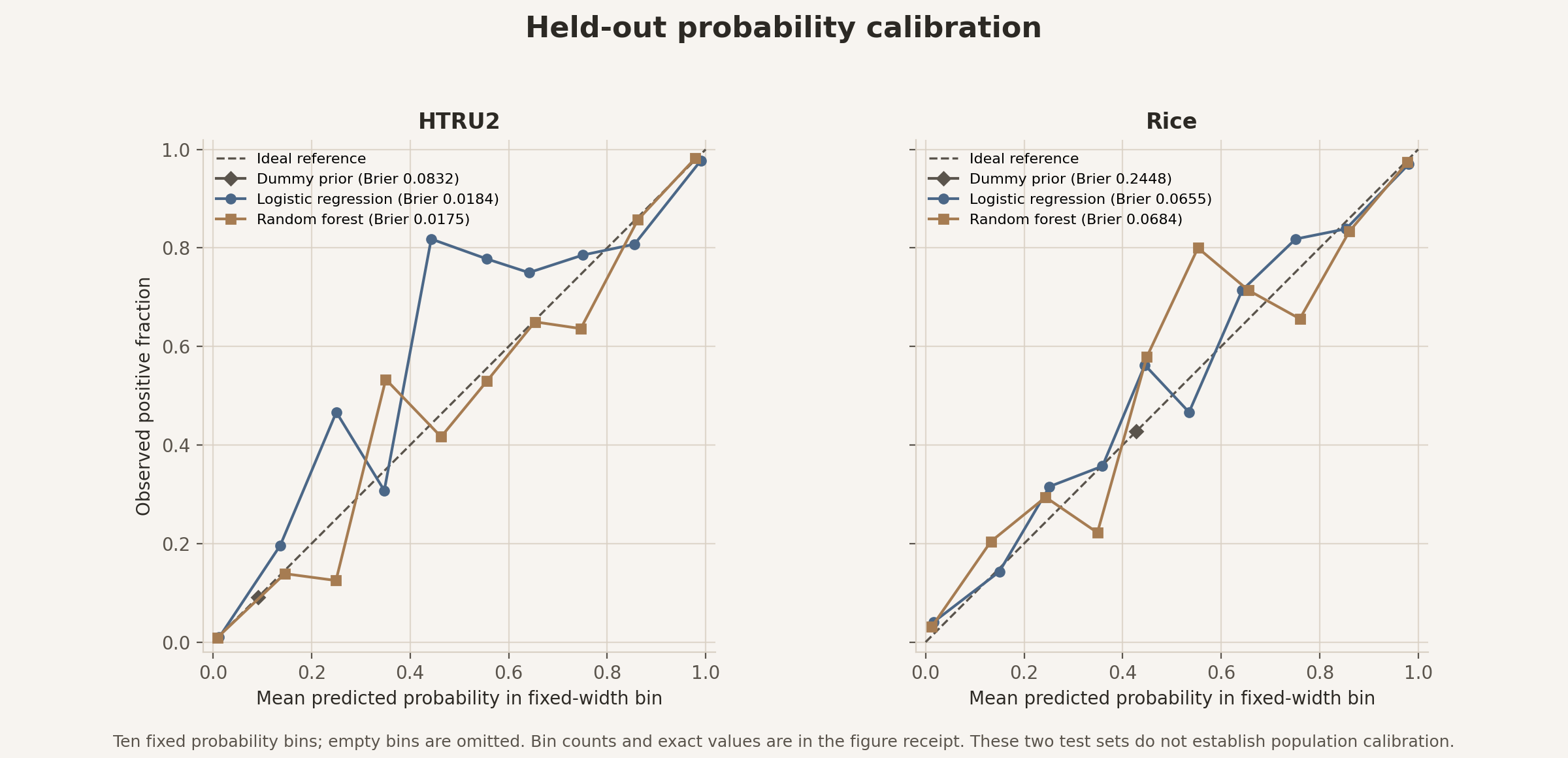
Scroll horizontally to inspect the diagram. The caption below provides a full text explanation.
Random forest had the lower HTRU2 point estimates for both probability scores: Brier loss 0.0175 versus 0.0184 and log loss 0.0725 versus 0.0784. With the consistent forest-minus-logistic sign convention, the log-loss difference was -0.0059 [-0.0116, -0.0005], while the Brier difference was -0.0009 [-0.0022, +0.0003]. The well-populated lowest- and highest-probability bins were close to the diagonal for both models. For example, the forest’s 3,189 rows below 0.1 averaged 0.0090 against an observed fraction of 0.0094, and its 228 rows at or above 0.9 averaged 0.9793 against 0.9825. Logistic regression’s corresponding bins held 3,204 rows at 0.0123 against 0.0097 and 221 rows at 0.9901 against 0.9774. The middle bins show gaps between mean predicted probability and observed positive fraction, but each held only 9 to 51 rows. Those local gaps may be sampling noise and should not be generalized. Neither model is therefore certified as universally calibrated.
The ranking and probability views may disagree without contradiction. A model can order two candidates correctly while assigning both probabilities that are too high or too low. A strictly increasing transformation changes the numerical scores without changing their order; for example, squaring two probabilities between zero and one preserves which is larger. Such a change preserves ranking while generally changing log loss and Brier loss. That is why an AP edge and a probability-score edge can belong to different models.
The reference threshold is not an operating recommendation
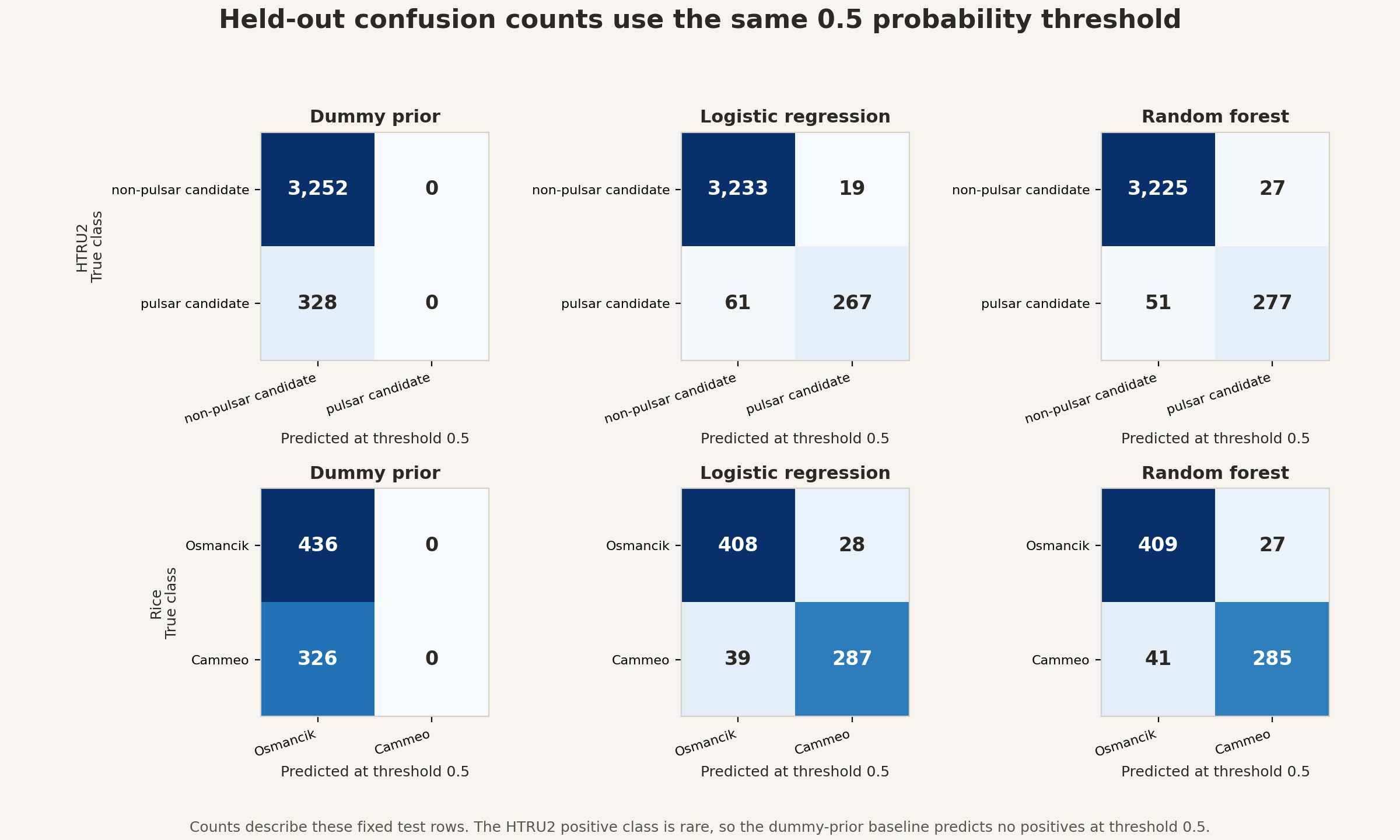
Scroll horizontally to inspect the diagram. The caption below provides a full text explanation.
At a threshold of 0.5, logistic regression labeled 286 candidates positive, including 267 of the 328 positive rows and 19 of the 3,252 negative rows. Random forest labeled 304 candidates positive, including 277 positives and 27 negatives. Those counts show why a threshold must be tied to an objective. Missing a real pulsar candidate and spending human time on RFI are different costs. This dataset does not tell us the relative cost of missing one real pulsar candidate versus spending time reviewing one false alarm. It also does not supply live survey prevalence, staffing limits, or consequences of delayed review needed to recommend one threshold.
Why the models differ here
The performance receipts tell us what happened on the held-out rows. They do not automatically tell us why. Interpretation starts only after the predictive comparison, and it must stay conditional on correlated features and the fitted models.
Held-out permutation importance measures how much a chosen test score changes when one feature’s values are shuffled among held-out rows while the fitted model stays fixed. The shuffle breaks that feature’s association with the label and its relationships with the other predictors. It can therefore create feature combinations that are uncommon in the source table. Predictors that move together can share or mask importance, so a small drop does not prove that a feature is irrelevant (Pearson correlation is one linear summary of that kind of association). Two column names need translation here. Profile excess kurtosis summarizes how the pulse-profile peak and tails differ from a normal-distribution reference. Dispersion-curve SNR standard deviation measures how much signal strength varies across the trial dispersion corrections.
For logistic regression, shuffling profile excess kurtosis reduced held-out AP by a mean 0.8565 across 30 permutations, with repeat standard deviation 0.0020; the next-largest mean drop was 0.0803 for dispersion-curve SNR standard deviation, with repeat standard deviation 0.0058. For random forest, the corresponding two mean drops were 0.6598 (0.0143 repeat standard deviation) and 0.0185 (0.0037). These standard deviations describe variation across the 30 shuffles. They are not confidence intervals. Repeatedly inspecting test-set importance can also become a form of test-set tuning. If an analyst changes the model after seeing these importance results, the supposedly untouched test set has quietly become development data. Here it is a fixed descriptive analysis after evaluation.
Importance evidence: permutation-importance receipt, generator, and provenance and verification.
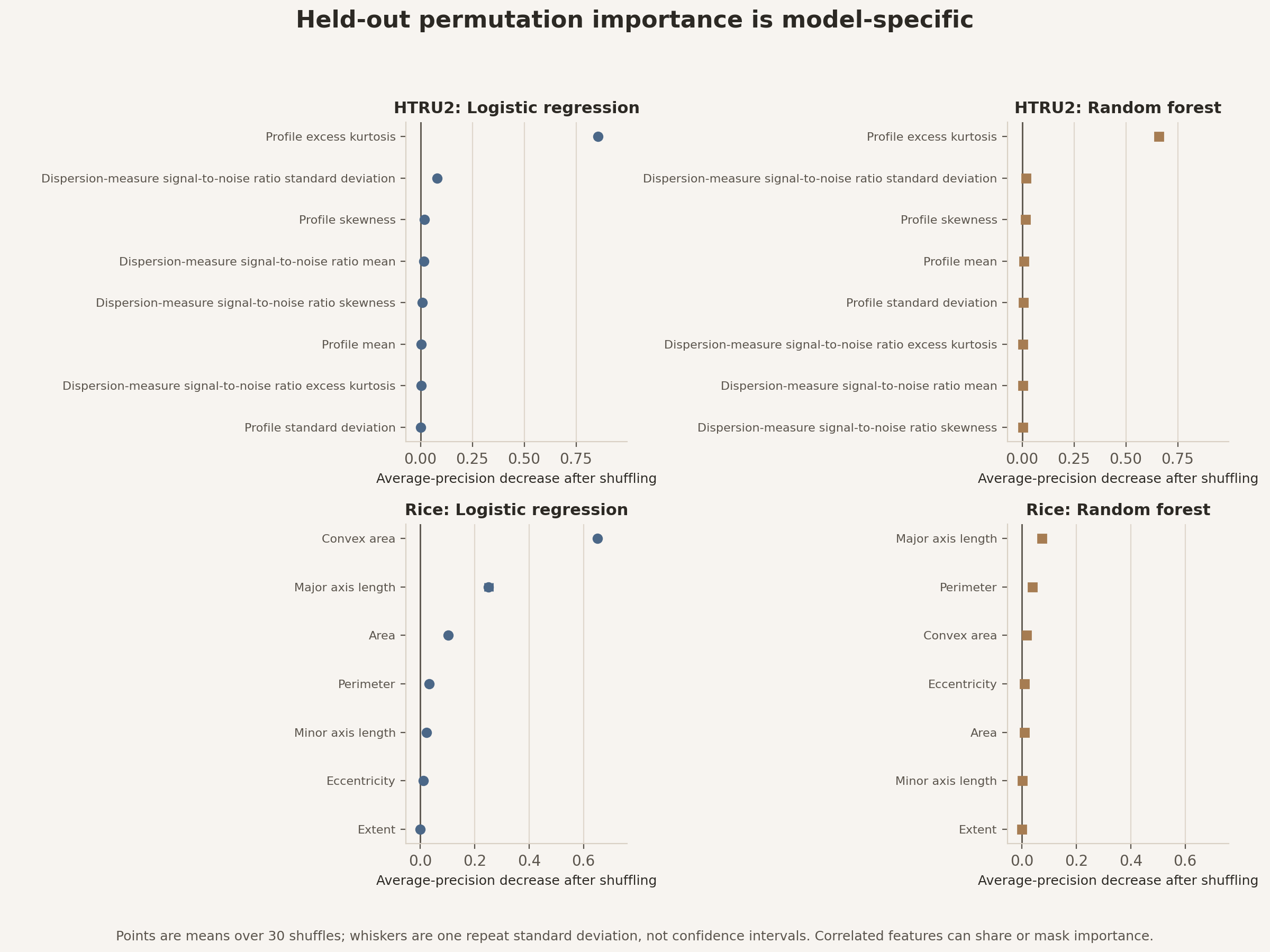
Scroll horizontally to inspect the diagram. The caption below provides a full text explanation.
Permutation importance can show which measured columns the fitted predictions depend on most under this test, but it does not reveal the full shape of the decision boundaries or isolate why one model performs differently. In the displayed HTRU2 diagnostic, shuffling profile excess kurtosis caused the largest AP decrease for each fitted model. The decrease was larger for the logistic fit than for the forest fit, but these values are conditional on each model’s different baseline predictions and cannot be read as a direct measure of causal effect or boundary shape. When two columns carry overlapping information, the model may fall back on one after the other is shuffled. A small importance drop can therefore hide information shared across correlated features. Repeat standard deviations quantify only the 30 permutation draws, not sampling uncertainty. A stronger follow-up would write down one or two proposed interaction features before inspecting new evaluation labels, or adjust a forest’s raw probabilities using a separate calibration subset inside the training data or cross-validated out-of-fold predictions. An out-of-fold prediction scores each training row with a temporary model that did not fit that row. The completed choice could then be tested on newly acquired data with grouping identifiers.
From scores to telescope workload
The candidate queue is where abstract measures become work. A score orders candidates. A probability attaches a numerical estimate. A threshold decides which candidates cross into the review set. The three steps should remain visible because an operational team can change the last step without refitting the first two.
At the fixed 0.5 threshold, logistic regression sent 286 of 3,580 candidates to the review side and missed 61 of 328 positive rows. Random forest sent 304 candidates to review and missed 51 positives. Relative to logistic regression on this fixed test, the forest added 18 reviews, recovered 10 more positives, and added 8 false positives. This is a description of the held-out sample, not a promise about live operations. A new survey can change signal quality, the mix of RFI, how common different feature values are, and positive prevalence. Any deployment would require monitoring future live candidates and choosing a threshold from real review capacity and error costs.
Workload evidence: confusion-count receipt, generator, and provenance and verification.
The practical lesson is less dramatic and more useful than “the forest wins” or “the linear model wins.” For ranking, the forest had a modest AP edge, while the ROC AUC difference was close to zero under fixed-test resampling. For probability quality, the forest had lower log loss and a slightly lower Brier point estimate, although the Brier interval crossed zero. At 0.5, that forest fit sent 18 more held-out candidates to review, recovered 10 more positives, and added 8 false positives; only an operational cost and capacity analysis could decide whether that trade is desirable. A model should be selected for the job it must perform, then tested on the kind of data where that job will occur.
Do the conclusions travel? A Rice morphology transfer check
Now change the subject without changing the discipline. The Rice (Cammeo and
Osmancik) dataset contains 3,810 imaged rice grains, with seven numerical
morphology measurements per grain. There are 1,630 Cammeo rows and 2,180
Osmancik rows. Before splitting, the generator confirmed seven numeric features
per row and found zero feature cells that were missing, infinite, or NaN;
zero rows that duplicated all seven feature values of another row; and zero
rows that duplicated both another row’s features and label. The source table
has no persistent row identifier, or stable ID that follows the same grain
across files or processing steps. Its bundled Attribute-Relation File Format
(ARFF) file, a text format that stores column declarations and data rows, does
not encode measurement units. These checks are recorded in the analysis
receipt and post-wide provenance
manifest. The release is available under Creative Commons
Attribution 4.0 (Rice at the UCI Machine Learning
Repository; Cinar and Koklu, 2019).
One row is one imaged grain. The features are area, perimeter, major-axis length, minor-axis length, eccentricity, convex area, and extent. These are shape measurements, not direct genetic or developmental mechanisms. The release supplies no farm, field, harvest, lot, camera, or acquisition-batch identifier. A stratified random row split therefore evaluates new rows from this released acquisition setting, not a new farm, season, or imaging system.
Rice is useful here because it changes more than the nouns. Its two class counts are closer together than the HTRU2 counts, and its seven measurements describe overlapping aspects of physical shape. Area and convex area both track size. Major-axis and minor-axis length describe the long and short directions of a fitted shape. Perimeter, eccentricity, and extent add boundary, elongation, and bounding-box information. Correlation among these measurements means that neither a large logistic coefficient nor a large permutation drop can be read as one feature’s independent biological importance.
The table is also unusually clean. Every released feature cell is numeric and present, so this worked example needs no imputation, meaning no missing values have to be filled in before fitting a model. That convenience should not be mistaken for complete study metadata. In a less-prepared imaging study, we would first inspect malformed values, unit conventions, duplicate images, technical repeats, camera settings, and whether several grains came from the same lot. Those checks determine what a row means and whether a row-wise split matches the intended claim.
We fit a new logistic model and a new random forest on the Rice training rows. The same code functions, split discipline, model-selection logic, metric definitions, and receipt format are reused. No fitted parameter crosses from HTRU2 into Rice. Calling this a transfer check means that the reasoning protocol is tested in a second domain.
The repetition is deliberate. The Rice logistic pipeline learns its own means, standard deviations, weights, and intercept from Rice training rows. The Rice forest learns its own thresholds and leaves from those rows. A Rice-specific prevalence-only predictor supplies the feature-free control. The fixed held-out Rice rows stay outside fitting and hyperparameter tuning in the published workflow, just as the HTRU2 candidates do. Applying the same reported protocol makes the comparison auditable, while the earlier screening disclosure prevents it from being mistaken for prospective confirmation.
The Rice panels in the four shared empirical figures report the second fit without inventing a two-dimensional morphology boundary. All seven features enter each Rice model; the figure compares performance measures, not a claim that two selected measurements contain the whole decision rule.
On the 762 fixed Rice test rows, logistic regression had AP 0.9643 and random forest had AP 0.9607. The consistent forest-minus-logistic difference was -0.0036, with a 95 percent paired fixed-test stability interval of [-0.0073, +0.0002], which remains compatible with little or no AP difference. ROC AUC was 0.9688 versus 0.9648, with difference -0.0040 [-0.0070, -0.0011]. Balanced accuracy at 0.5 was 0.9081 versus 0.9062, with difference -0.0019 [-0.0119, +0.0084]. Logistic regression also had lower log loss, 0.2264 versus 0.2420; the forest-minus-logistic difference was +0.0155 [+0.0034, +0.0275]. Brier loss was 0.0655 versus 0.0684, with difference +0.0029 [-0.0002, +0.0059]. The AP, balanced-accuracy, and Brier intervals remain compatible with little or no difference under this fixed-row resampling, while the ROC AUC and log-loss intervals retain the logistic direction. No operational utility or minimum meaningful difference was specified. A minimum meaningful difference is the smallest improvement large enough to change a practical decision or justify added complexity. Without one, none of these numerical gaps should be labeled practically important. The intervals do not include uncertainty from the chosen split, tuning, refitting, grouping, or how and where the data were collected, and they are not population confidence intervals.
Rice-result evidence: analysis receipt, generator, and provenance and verification.
Read those Rice panels in the same order as the astronomy panels. The AP and ROC AUC panel asks how the separately fitted models rank the two recorded rice varieties. The reliability panel asks how their probabilities behave on the held-out grains. The confusion-count panel applies the same reference threshold of 0.5, which is a common convention but not a claim about the best sorting policy. The permutation panel asks which recorded measurements most affect each fitted model’s held-out score when shuffled. It does not identify a gene, growth process, or causal morphology pathway.
Raw AP and Brier values should not be compared directly between Rice and HTRU2. AP depends on positive-class prevalence, and Brier loss also depends on the class balance and the evaluation distribution. Even the feature-free predictor has Brier loss 0.0832 on HTRU2 but 0.2448 on Rice, showing that raw Brier values can change before features contribute anything. The honest cross-domain comparison is narrower: did the direction and size of the logistic-versus-forest difference remain similar within each dataset? The within-dataset direction changed. For AP, forest minus logistic was +0.0121 [+0.0012, +0.0257] in HTRU2 but -0.0036 [-0.0073, +0.0002] in Rice. For log loss, where lower is better, the same forest-minus-logistic convention gave -0.0059 [-0.0116, -0.0005] in HTRU2 and +0.0155 [+0.0034, +0.0275] in Rice. The Brier point differences likewise changed sign, from -0.0009 in HTRU2 to +0.0029 in Rice, although both Brier intervals crossed zero. These within-dataset differences belong to their own fixed splits and do not compare raw difficulty across domains.
Cross-domain contrast evidence: analysis receipt, generator, and provenance and verification.
That restriction is important. A larger raw AP in Rice would not show that rice classification is intrinsically easier, because its positive class is much more common under the chosen label mapping. A smaller raw Brier loss in one dataset could partly reflect its class balance. The paired forest-minus-logistic difference within one held-out dataset is the defensible comparison. Any attempt to place both datasets on one common scale must state what baseline it uses.
The observed Rice results support a narrow version of the global-rule interpretation. Logistic regression was competitive on AP and balanced accuracy, had the higher ROC AUC point estimate, and had lower log loss. That means one global regularized score captured much of the predictive structure available in these seven released measurements under this split. It does not mean grain biology is linear, identify a biological mechanism, or establish performance outside the released acquisition setting.
The Rice check keeps the title honest. “Forest in the Sky” names one of the models and the astronomy setting. It does not promise that the forest wins. The Rice check reverses the HTRU2 point-estimate ordering for AP, ROC AUC, log loss, and Brier loss: the global logistic rule is at least competitive and has the lower Rice log loss. The result sharpens the practical conclusion that extra flexibility must earn its place under the dataset, metric, and decision objective at hand. It does not show that grain biology is linear or that either model will generalize to a new farm or imaging system. Complexity is not a ladder on which one model always stands above another. The useful structure depends on the patterns in the measured features, the probability goal, and the decision objective.
A practical choice guide
Start with logistic regression when one global additive score is a reasonable description of the task, you want a compact account of each feature’s fitted contribution given the others, and predictions should change gradually rather than jump as inputs change. Standardize numerical features inside the fitted pipeline, tune regularization without touching the test, and inspect whether obvious nonlinear patterns or interactions remain.
Start with a random forest when threshold effects and interactions are plausible, the table is mostly numerical or cleanly encoded, and held-out evidence shows that the additional flexibility improves the chosen objective. Tune leaf size and related complexity controls on training-only folds. Inspect probability quality rather than assuming tree averaging creates calibrated probabilities.
Prefer neither by reputation. Compare both with a feature-free baseline and a fixed held-out test. Decide whether the real job is ranking, probability estimation, or a thresholded action. If probabilities will drive high-stakes decisions, use a separate calibration stage, which learns a correction from raw model scores to probabilities. Learn that correction from either a separate calibration subset inside training or cross-validated out-of-fold training predictions, never from final-test labels. Then use prospective validation, testing the completed workflow on future data collected after those choices are frozen. If rows have groups, repeated measures, or acquisition batches, split on the unit that matches the intended claim rather than assuming rows are independent. For example, keep every grain from one lot or imaging batch entirely in training or entirely in testing.
| Question | Evidence to inspect | Common mistake |
|---|---|---|
| Can one global score rank cases well enough? | Held-out AP and ROC AUC beside prevalence | Assuming a nonlinear model must rank better. |
| Are the probabilities useful? | Brier loss, log loss, reliability bins, and bin counts | Calling a low Brier loss proof of calibration. |
| What happens at an action threshold? | Confusion counts and workload at thresholds chosen before inspecting the test results | Treating 0.5 as a universal operating point. |
| Does complexity earn its cost? | Paired held-out differences and uncertainty | Counting metric wins or selecting on the final test. |
| Will the result travel? | Grouped or prospective validation in the target setting | Generalizing a row split to a new survey, farm, or camera. |
Findings and limits
What pattern appeared in HTRU2?
Logistic regression alone already far outperformed the prevalence-only control on the fixed HTRU2 rows (AP 0.9141 versus 0.0916). Random forest then edged that logistic fit on the primary AP, 0.9262 versus 0.9141, with forest-minus-logistic difference +0.0121 [+0.0012, +0.0257]. It also had lower log loss, 0.0725 versus 0.0784, with difference -0.0059 [-0.0116, -0.0005], while its Brier advantage was smaller, 0.0175 versus 0.0184 and -0.0009 [-0.0022, +0.0003]. At 0.5, the forest recovered 277 of 328 positives versus 267 for logistic regression, while producing 27 rather than 19 false positives. These fixed-test stability intervals are not population confidence intervals and omit split uncertainty.
HTRU2 finding evidence: analysis receipt, generator, and provenance and verification.
What changed in the Rice check?
The Rice point-estimate direction did not match HTRU2. Logistic regression had AP 0.9643 versus 0.9607 for random forest, with forest-minus-logistic difference -0.0036 [-0.0073, +0.0002], and lower log loss, 0.2264 versus 0.2420, with difference +0.0155 [+0.0034, +0.0275]. Logistic regression also had the higher ROC AUC point estimate and the lower Brier point estimate, but the AP and Brier intervals remained compatible with little or no difference under fixed-test row resampling. This reversal is evidence against a universal model ranking, not evidence that one domain is intrinsically easier.
Rice finding evidence: analysis receipt, generator, and provenance and verification.
Why is the comparison useful?
The two models expose a practical choice that a leaderboard can hide. Logistic regression asks whether one smooth global score is enough. A random forest asks whether many local threshold paths earn their extra flexibility. Separating ranking, probability quality, and threshold workload turns “which model is better?” into a set of answerable questions.
What does this analysis not establish?
- It introduces no new logistic-regression, decision-tree, random-forest, calibration, or metric method.
- It does not discover a pulsar, validate an operational telescope pipeline, or estimate performance on another survey.
- It does not fit a model in astronomy and transfer it to biology, or vice versa. Each dataset receives separate fits.
- It does not establish performance on a new rice farm, harvest, lot, batch, camera, or season.
- It does not turn coefficients, tree splits, or permutation importance into causal or biological mechanisms.
- It does not make 0.5 the correct threshold. Operational costs and review capacity were not supplied.
- It does not establish that candidate or grain rows are independent sampling units beyond what the public metadata support.
- It does not establish that either model family is universally superior.
Discussion
Everything in this section is interpretation. The held-out results have machine-readable receipts, but they remain descriptive estimates from a workflow chosen after exploratory screening. The explanations and follow-up hypotheses below need their own prespecified tests, meaning tests whose questions and success criteria are written down before the new evaluation results are inspected.
The comparison motivates testing global versus local structure. The permutation diagnostic cannot establish that interactions or local boundaries caused the forest’s edge because shuffling also breaks predictor relationships and correlated features can substitute for one another.
A direct follow-up would choose one or two logistic additions in advance, such as particular interactions or monotonic transformations, one-directional remappings such as taking the logarithm of a positive feature. A separate training-side calibration study could learn a probability correction from a held-aside training subset or cross-validated out-of-fold training predictions, then ask whether probability-score differences remain. Neither follow-up should be designed and judged on the same labels used in this article.
The Rice result asks a different interpretive question. If the global model is competitive or stronger on grain morphology, that does not mean biology is linear. It means that for these seven released measurements, this row split, these two labels, and this evaluation protocol, the global rule captured much of the useful predictive structure. If the forest is stronger instead, it still does not identify a biological mechanism. In both directions, the claim belongs to the released table rather than the domain as a whole.
The missing group identifiers matter as much as model family. Random row splits can place related acquisition conditions on both sides of the test boundary. For example, if grains photographed in the same batch share lighting quirks and appear on both sides of the split, a model may partly recognize the batch rather than the variety. Its row-level test result can then overstate performance on a genuinely new batch. The present releases do not let us measure that risk directly. The strongest next study is therefore not automatically a larger model. It is a dataset with the source, session, batch, field, or camera identifiers needed to align the split with the intended deployment claim.
Reproduce and audit the study
The page bundle is designed so the article, code, data-source audit, held-out row identifiers and split hashes, predictions, metrics, figures, and hashes travel together. Run:
uv run --frozen reproduce.py --verify
The generator makes no network request and reads the bundled source files. The
uv run wrapper can still provision missing locked dependencies, meaning the
exact package versions recorded for this project, so the full command is not
guaranteed to avoid downloads. Verification recomputes both fixed splits,
training-only searches, predictions, metrics, tables, the launcher notebook,
and figures in a temporary directory. It then compares 20 generated artifacts
byte for byte with the bundle. Byte identity is claimed only in the recorded
reference environment; the operating system, numerical libraries, and
font-rendering libraries can change output bytes.
The two single-model curve figures, one per model, come from a second and much
smaller generator. It fits nothing. It reads the held-out probabilities that
reproduce.py already committed, re-derives every value it draws, and stops
with an error if any of them disagrees with the separately committed metric
export:
uv run plot_holdout_curves.py --verify
That command also redraws both figures in a temporary directory and compares
the bytes with the hash recorded in each figure receipt. The manifest that
reproduce.py writes lists those two figures and hashes both their receipts
and this second generator, so the two commands check the same bundle from
opposite ends.
Here, an artifact is a file used or produced by the analysis. A receipt is a machine-readable record of inputs, settings, or results. The provenance manifest links a number printed in the article to its exact receipt field and file fingerprint.
Compact artifact ledger
| Artifact | What it lets a reader audit | File |
|---|---|---|
| Analysis generator | Data checks, split, model fitting, metrics, figures, and verification | reproduce.py |
| Single-model figure generator | The two per-model held-out curve figures, re-derived from the committed predictions and cross-checked against the metric export | plot_holdout_curves.py |
| Environment lock | Exact Python package versions | reproduce.py.lock |
| Reproduction launcher notebook | Downloads hash-checked bundle files, invokes the analysis generator, and displays its figures | forest-in-the-sky.ipynb |
| Source attribution and hashes | UCI records, licenses, column authority, and local source hashes | ATTRIBUTION.txt |
| Held-out row assignment | Source-row identifiers for every test row, numbered from 0; training contains every row not listed as test, with split hashes and counts in the analysis receipt | receipts/test-predictions.csv; receipts/analysis.receipt.json |
| Held-out predictions | Both model probabilities and labels for every final test row | receipts/test-predictions.csv |
| Metric receipt | Fixed metric conventions, values, paired differences, and intervals | receipts/analysis.receipt.json, with a flat metric export in receipts/test-metrics.csv and all bootstrap replicates in receipts/paired-bootstrap.csv |
| Figure receipts | Plotted values, accessible descriptions, hashes, and notes explaining what each figure can and cannot support | logistic curves, forest curves, ranking, calibration, confusion counts, permutation importance, and social card |
| Provenance manifest | Links from numbers printed in the article to their exact receipt fields | provenance.json |
Compact numerical provenance audit
- HTRU2 has 17,898 candidate rows
- HTRU2 includes 1,639 positive-labeled candidates
- Rice has 3,810 grain rows
- Rice includes 1,630 Cammeo grains
- HTRU2 dummy prior held-out AP 0.0916
- HTRU2 dummy prior held-out ROC AUC 0.5000
- HTRU2 logistic regression held-out AP 0.9141
- HTRU2 logistic regression held-out ROC AUC 0.9756
- HTRU2 random forest held-out AP 0.9262
- HTRU2 random forest held-out ROC AUC 0.9767
- HTRU2 random-forest-minus-logistic-regression held-out AP +0.0121 [+0.0012, +0.0257]
- Rice dummy prior held-out AP 0.4278
- Rice dummy prior held-out ROC AUC 0.5000
- Rice logistic regression held-out AP 0.9643
- Rice logistic regression held-out ROC AUC 0.9688
- Rice random forest held-out AP 0.9607
- Rice random forest held-out ROC AUC 0.9648
- Rice random-forest-minus-logistic-regression held-out AP -0.0036 [-0.0073, +0.0002]
The manifest also carries grouped, machine-readable coverage entries, meaning structured records that verification code can check automatically, for every remaining evidentiary value:
- HTRU2 complete held-out result values
- Rice complete held-out result values
- HTRU2 held-out ranking figure values
- Rice held-out ranking figure values
- HTRU2 held-out probability-score and reliability-bin figure values
- Rice held-out probability-score and reliability-bin figure values
- HTRU2 held-out confusion-count and workload figure values
- Rice held-out confusion-count and workload figure values
- HTRU2 held-out permutation-importance figure values
- Rice held-out permutation-importance figure values
- Social-card held-out average-precision values
Each line or grouped entry is bound to a receipt field and receipt SHA-256 in
provenance.json. Grouped entries contain the complete
machine-readable arrays or objects behind a figure or dataset result block, not
only the values selected for the prose. These links make the reported values
traceable; they do not establish performance in a wider population.
Technical appendix
Exact split and model-selection contract
| Item | Fixed value |
|---|---|
| HTRU2 source SHA-256 | b13b4d8929e96ecd196e464c1c8a454c3ac2ffa631015f6388957531a9923f59 |
| HTRU2 bundled Readme SHA-256 | 691efe1b5b910401959a9b4f74ed0959dcd205d69c73cf524646e6f63a3eb86b |
| Rice Attribute-Relation File Format (ARFF) source SHA-256 | 1af97883100c89de2ea2972f7a28d428f4f1c14711a61defc0b0569e9eb65665 |
| Initial test fraction and random seed | Stratified 20 percent test split; random state 20261093 for HTRU2 and 20261266 for Rice |
| Internal cross-validation | Five randomized folds that preserve class balance were created once per dataset and then reused unchanged for both model searches; random state 20271093 for HTRU2 and 20271266 for Rice |
| Logistic-regression grid | C in {0.01, 0.1, 1.0, 10.0, 100.0} for an L2-regularized lbfgs logistic regression after fold-fitted StandardScaler; class_weight=None and max_iter=5000 |
| Random-forest grid | 250 bootstrap trees with Gini splits; max_depth in {6, 12, None}, min_samples_leaf in {1, 5}, and max_features in {"sqrt", 0.75}; class_weight=None |
| Selection metric and tie rule | Mean validation average precision; GridSearchCV chooses the first candidate in scikit-learn’s ParameterGrid order when mean validation scores are exactly tied |
| Paired bootstrap | 2,000 paired, class-stratified resamples of each fixed test set; random state 20301093 for HTRU2 and 20301266 for Rice; 2.5th and 97.5th percentiles from numpy.quantile(method="linear"); fixed fitted models and observed class counts; not a population confidence interval |
| Software versions | CPython 3.12.12, NumPy 2.3.2, scikit-learn 1.7.1, and Matplotlib 3.10.3 in the recorded reference environment; the lock requires Python 3.12 and pins all package dependencies |
The Secure Hash Algorithm 256-bit digest (SHA-256) beside each source is a fixed-length fingerprint used here to detect any byte-level change in that file. It does not certify that the source is scientifically correct.
The term random seed means the fixed initial state supplied to a pseudorandom procedure so the same split and resamples can be reproduced. It does not make the chosen split uniquely correct. The seed and stable row indices are stored so another reader can recreate this particular analysis.
HTRU2 column order used by the generator
The bundled Readme defines the eight inputs in this order:
- mean of the integrated profile;
- standard deviation of the integrated profile;
- excess kurtosis of the integrated profile;
- skewness of the integrated profile;
- mean of the dispersion-measure signal-to-noise curve;
- standard deviation of that curve;
- excess kurtosis of that curve; and
- skewness of that curve.
The ninth column is the binary class label. Excess kurtosis summarizes how the tails and central peak of a distribution differ from a normal-distribution reference under the file’s convention. Skewness summarizes asymmetry. The analysis treats these as supplied numerical features rather than re-estimating them from raw telescope time series.
Rice columns used by the generator
The seven inputs are area, perimeter, major-axis length, minor-axis length,
eccentricity, convex area, and extent. The class label is Cammeo or Osmancik.
Eccentricity describes how elongated the fitted ellipse is. Convex area
is the area inside the grain outline’s convex hull, the smallest convex shape
that contains it. Extent compares grain area with the area of its bounding
box. The bundled data/Citation_Request.txt
describes area and convex area as pixel counts, perimeter using distances
between boundary pixels, and extent as a ratio. The generated audit records
normalized feature names, not exact source spellings or a complete unit schema.
Metric conventions
- The positive label is pulsar candidate for HTRU2 and Cammeo for Rice. Cammeo is positive only to define the binary metrics and does not imply preference or biological value.
- AP is scikit-learn’s non-interpolated recall-weighted average precision.
- ROC AUC uses the continuous positive-class score, the model’s probability-like number before a threshold turns it into a yes-or-no prediction.
- Balanced accuracy is the unweighted mean of positive-class and negative-class recall at threshold 0.5.
- Brier loss is the mean squared error of positive-class probabilities on the zero-to-one scale.
- Log loss uses natural logarithms and clips each positive-class probability to
the closed interval from
1e-15to1 - 1e-15before taking the logarithm. This prevents the undefined calculation \(\log(0)\) when a model reports exactly zero or one. - Reliability curves use ten fixed-width bins,
[0.0, 0.1),[0.1, 0.2), through[0.9, 1.0]. Empty bins are omitted from the plot but retained with zero counts in the receipt, and every displayed point reports its bin count. - Paired differences use random forest metric minus logistic-regression metric for every measure. Positive favors the forest for higher-is-better measures, while negative favors the forest for lower-is-better log loss and Brier score, so the sign is interpretable without consulting code.
- The paired interval is the 2.5th to 97.5th percentile interval across 2,000
paired, class-stratified resamples of the fixed held-out rows, using the same
sampled row indices for all models and
numpy.quantile(method="linear"). The interval preserves the observed positive and negative counts and holds both fitted models fixed. It is a fixed-test stability interval, not a population confidence interval, and it does not include split, tuning, refitting, forest-seed, grouping, or acquisition uncertainty.
References
- Robert J. Lyon, B. W. Stappers, S. Cooper, J. M. Brooke, and J. D. Knowles. “Fifty Years of Pulsar Candidate Selection: From simple filters to a new principled real-time classification approach.” Monthly Notices of the Royal Astronomical Society 459(1), 1104-1123 (2016). doi:10.1093/mnras/stw656.
- Robert Lyon. “HTRU2.” UCI Machine Learning Repository. doi:10.24432/C5DK6R.
- D. R. Cox. “The Regression Analysis of Binary Sequences.” Journal of the Royal Statistical Society: Series B 20(2), 215-232 (1958). doi:10.1111/j.2517-6161.1958.tb00292.x.
- scikit-learn developers.
LogisticRegressionapplication programming interface (API) and linear-model guide. Official API; official guide. - Leo Breiman, Jerome H. Friedman, Richard A. Olshen, and Charles J. Stone. Classification and Regression Trees (1984). doi:10.1201/9781315139470.
- Leo Breiman. “Random Forests.” Machine Learning 45, 5-32 (2001). doi:10.1023/A:1010933404324.
- scikit-learn developers.
RandomForestClassifierAPI and forest guide. Official API; official guide. - Jesse Davis and Mark Goadrich. “The Relationship Between Precision-Recall and ROC Curves.” ICML 2006, 233-240. doi:10.1145/1143844.1143874.
- scikit-learn developers.
average_precision_scoreAPI. Official API. - scikit-learn developers. Model-evaluation guide. Official guide.
- Glenn W. Brier. “Verification of Forecasts Expressed in Terms of Probability.” Monthly Weather Review 78(1), 1-3 (1950). Official journal page.
- Tilmann Gneiting and Adrian E. Raftery. “Strictly Proper Scoring Rules, Prediction, and Estimation.” Journal of the American Statistical Association 102(477), 359-378 (2007). doi:10.1198/016214506000001437.
- Alexandru Niculescu-Mizil and Rich Caruana. “Predicting Good Probabilities with Supervised Learning.” ICML 2005, 625-632. doi:10.1145/1102351.1102430.
- scikit-learn developers. Probability-calibration guide. Official guide.
- Bradley Efron. “Bootstrap Methods: Another Look at the Jackknife.” The Annals of Statistics 7(1), 1-26 (1979). doi:10.1214/aos/1176344552.
- Ilkay Cinar and Murat Koklu. “Rice (Cammeo and Osmancik).” UCI Machine Learning Repository. doi:10.24432/C5MW4Z.
- Ilkay Cinar and Murat Koklu. “Classification of Rice Varieties Using Artificial Intelligence Methods.” International Journal of Intelligent Systems and Applications in Engineering (2019). doi:10.18201/ijisae.2019355381.
- W. W. Peterson, T. G. Birdsall, and W. C. Fox. “The Theory of Signal Detectability.” Transactions of the IRE Professional Group on Information Theory 4(4), 171-212 (1954). doi:10.1109/TIT.1954.1057460.
- Tom Fawcett. “An Introduction to ROC Analysis.” Pattern Recognition Letters 27(8), 861-874 (2006). doi:10.1016/j.patrec.2005.10.010.
- Allan H. Murphy. “A New Vector Partition of the Probability Score.” Journal of Applied Meteorology 12(4), 595-600 (1973). doi:10.1175/1520-0450(1973)012<0595:ANVPOT>2.0.CO;2.